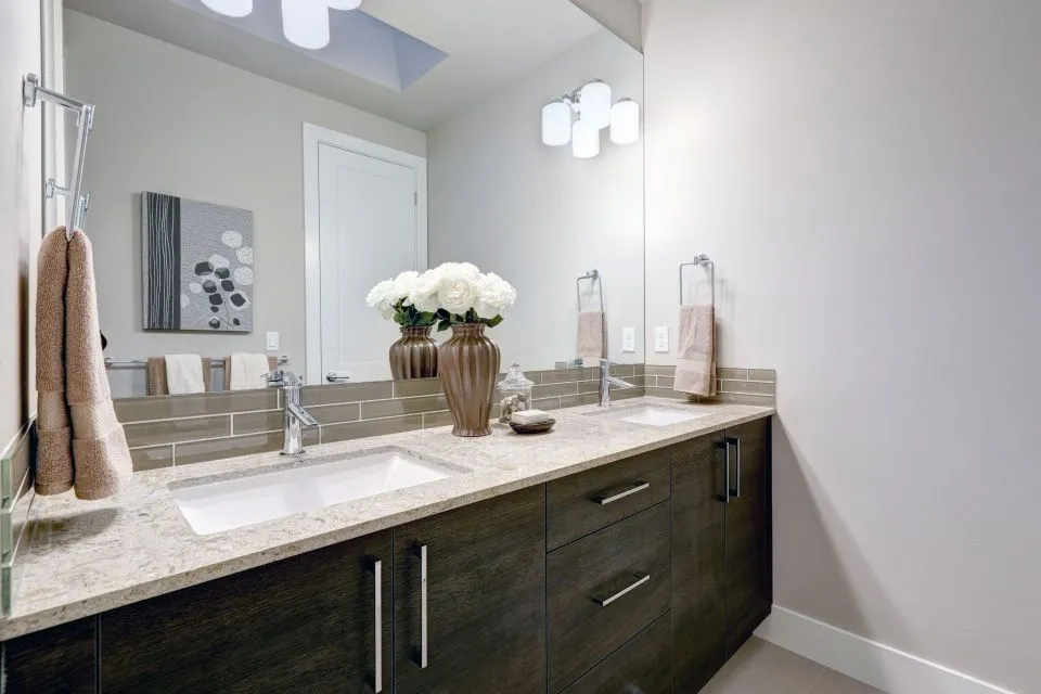
Designing a backsplash that complements your new countertops
A backsplash can shape the entire personality of a kitchen or bathroom. It protects the wall from water, grease, and daily wear, yet its visual role is just as important as its practical function. The right tile, slab, pattern, and grout color can make a new countertop look intentional and beautifully integrated.
A successful design begins with the countertop as the foundation. Its color variation, movement, finish, edge profile, and material all influence the backsplash choices that will work best. Rather than selecting wall tile in isolation, consider how every surface will interact under natural light, task lighting, and the surrounding cabinetry.
The goal is a balanced composition. A quiet countertop can support a more expressive backsplash, while a heavily veined granite or marble surface often looks best with a simpler wall treatment. Careful coordination helps the room feel custom instead of visually crowded.
Start with the countertop’s visual character
Examine the countertop under the lighting conditions in the finished space. Quartz may have subtle veining, bold dramatic movement, or a consistent solid color. Granite can include several mineral tones, while marble often introduces directional veining that affects how a backsplash should be oriented. Porcelain and Dekton may mimic natural stone or deliver a sleek, contemporary appearance.
Identify the dominant color and two or three secondary tones in the countertop. Those supporting shades can guide the backsplash, cabinet hardware, paint, and accessories. A backsplash does not need to match the countertop exactly. Pulling out a quieter undertone, such as warm beige, soft gray, muted taupe, or charcoal, can create a connection without making the surfaces look identical.
Texture matters as much as color. Honed stone, glossy ceramic tile, matte porcelain, handmade zellige-style tile, and polished quartz each reflect light differently. When the countertop has a polished finish, a matte backsplash can add depth. If the counter is honed or leathered, a lightly reflective backsplash can brighten the room.
Homeowners planning a full surface update can review material and fabrication options through The Countertop Store, where countertop design, templating, edging, and installation are part of the remodeling process. Coordinating the backsplash during those early conversations makes it easier to account for seams, outlets, trim, and finished edges.
Decide whether the backsplash should blend or contrast
A tonal backsplash uses colors close to the countertop, creating a calm and continuous appearance. This approach works well in compact kitchens, transitional interiors, and rooms where cabinetry or fixtures provide the strongest visual statement. For example, a warm white quartz counter may pair with ivory subway tile, while a cool gray surface may work with pale gray porcelain.
A contrasting backsplash has a stronger color, shape, or pattern difference. Dark tile behind a light countertop can add definition, while a bright handmade tile can bring character to a simple white or wood-toned kitchen. Contrast is especially effective when the rest of the room is restrained and the backsplash serves as a deliberate focal point.
Contrast does not have to mean extreme color difference. A change in scale, texture, or finish can be enough. Large-format matte porcelain behind a polished counter creates a quiet modern contrast, while small mosaic tile introduces detail without requiring a dramatic hue.
Use the surrounding room to determine how much visual activity is appropriate. If the cabinets have a strong wood grain, the floor has patterned tile, and the countertop has prominent movement, a low-contrast backsplash will usually provide better balance. If the cabinets and floors are simple, a patterned backsplash can add energy without overwhelming the design.
Choose a tile size and layout that suit the room
Tile scale affects how large and organized a room feels. Large-format backsplash panels reduce grout lines and create a streamlined appearance, which can be useful in contemporary kitchens and bathrooms. They also highlight the natural pattern of porcelain, marble, or quartz-look surfaces.
Classic subway tile remains versatile because its proportions work with many design styles. A standard running-bond layout feels familiar, while vertical stacking gives the same tile a cleaner, taller appearance. Herringbone, chevron, basketweave, and grid layouts bring more movement, though they should be used thoughtfully when the countertop already contains pronounced veining.
Small mosaics can add softness and intricate detail, but they require more grout maintenance. They are especially useful for niches, narrow walls, range areas, or curved applications. Before choosing a detailed mosaic, confirm that its scale will remain attractive around outlets, corners, windows, and cabinet transitions.
The backsplash should also relate to the room’s proportions. Vertical tile can visually lift a low ceiling, while horizontal layouts can emphasize the width of a compact wall. Full-height installation behind a range or sink can create a strong architectural feature, particularly when the tile or slab continues toward the underside of the cabinets.
Coordinate grout, trim, and transitions
Grout color can change the entire impression of a backsplash. Matching grout makes the tile read as a continuous surface, while contrasting grout emphasizes each individual shape. A soft gray grout often defines white tile without creating the high-maintenance appearance of stark black lines.
For a polished and quiet design, select grout that closely resembles the tile. To highlight a geometric pattern, choose a grout with enough contrast to outline the layout. Keep the countertop in mind: a warm stone surface can look disconnected from a backsplash with cool blue-gray grout, even when the tile itself seems suitable.
Transitions deserve attention before installation begins. Decide how the backsplash will finish at open wall ends, windows, cabinets, and adjacent painted areas. Pencil liners, metal edge profiles, bullnose pieces, or mitered tile corners can provide a clean termination. The best choice depends on the tile thickness, design style, and desired level of detail.
A backsplash should meet the countertop with a neat, flexible joint rather than a rigid grout line. This connection can be finished with color-matched silicone caulk to accommodate minor movement and resist moisture. Proper planning also ensures that the countertop’s edge profile and backsplash thickness do not compete visually.
| Countertop character | Backsplash direction | Grout and finish approach |
|---|---|---|
| Quiet white or solid-color quartz | Add texture, pattern, or gentle contrast | Define the tile with soft contrasting grout |
| Boldly veined marble or granite | Use simple tile or a coordinated slab | Keep grout subtle and lines visually calm |
| Warm butcher block | Choose creamy ceramic, handmade tile, or warm stone | Use beige, ivory, or light taupe grout |
| Dark soapstone or charcoal surface | Add light tile or a reflective finish | Select low-contrast grout for a refined look |
| Porcelain or Dekton with a concrete look | Use large-format tile or minimalist stacked tile | Keep joints narrow and finish matte or satin |
| Patterned countertop | Repeat one quiet undertone in the backsplash | Match grout closely to avoid competing patterns |
Consider full-height slabs and statement areas
A slab backsplash can extend the countertop material up the wall, producing a continuous, high-end appearance. This approach works particularly well with quartz, porcelain, marble, and Dekton. It minimizes grout, emphasizes the material’s pattern, and simplifies cleaning behind a range or sink.
Full-height stone does not have to cover every wall. Many designs use a slab behind the cooktop or vanity while installing tile elsewhere. This creates a focal point and allows the most expressive part of the material to remain visible without increasing the visual weight of the entire room.
Vein direction is important when using a slab. Bookmatched or aligned patterns can create a dramatic effect, but the layout requires careful templating and fabrication. Electrical outlets, windows, shelves, range hoods, and cabinet clearances must be measured accurately before the material is cut.
For bathroom remodeling, a continuous slab or large-format porcelain backsplash can connect the vanity top to the wall while reducing grout in wet areas. The Countertop Store’s bathroom remodeling services include surfaces and custom features that can help coordinate vanity countertops, shower walls, pans, and integrated sinks within one cohesive design.
Match the backsplash to the room’s function
A kitchen backsplash near the cooking surface needs to tolerate heat, splashes, grease, and frequent cleaning. Nonporous quartz, porcelain, ceramic tile, and properly sealed natural stone are common choices. Highly textured tile may be attractive, but deep recesses can collect residue behind a range and require extra maintenance.
Around a sink, water resistance and easy cleaning become priorities. Large-format tile or slab surfaces reduce grout joints, while a properly sealed natural stone backsplash can provide durability with the right care. If the countertop includes an integrated sink, the smooth transition can be repeated visually with a simple, continuous wall treatment.
Bathroom backsplashes face different conditions, including humidity, toothpaste, cosmetics, and water from faucets. The material should coordinate with shower walls, flooring, vanity cabinetry, and plumbing fixtures. A small accent strip can connect the vanity wall to the shower without forcing every surface to use the same pattern.
Outdoor kitchens and entertaining areas also benefit from coordinated backsplash design. Porcelain, Dekton, and other durable surfaces may be better suited to sunlight, temperature changes, and exposure than delicate interior materials. The surrounding architecture should guide the color and texture so the backsplash feels connected to the patio or outdoor living space.
Use samples, lighting, and professional measurements
Small samples provide useful information, but they rarely show the full effect of a material. Place countertop and backsplash samples beside cabinet doors, flooring, paint, hardware, and appliances. View them in morning, afternoon, and evening light because undertones can shift substantially throughout the day.
If possible, inspect a larger tile or slab sample. A small sample may hide dramatic veining, repetitive printing, shade variation, or surface texture. Larger pieces also reveal whether the countertop and backsplash compete for attention when viewed together.
Lighting should be planned before the backsplash is finalized. Under-cabinet lights can highlight texture, make grout lines more visible, and emphasize natural stone movement. A glossy backsplash may reflect light beautifully, while a highly polished surface can create glare if fixtures are positioned directly opposite it.
Accurate measurements are essential for outlet placement, slab seams, tile quantities, edge details, and installation timing. Professional templating helps account for walls that are slightly out of square and ensures the backsplash aligns with the countertop, cabinets, and openings. Fabrication and installation should be coordinated so the finished surfaces meet cleanly.
Practical choices for a cohesive design
- Select the countertop before finalizing the backsplash so its undertones and movement guide the palette.
- Limit the room to a few related colors, using texture and scale for variety instead of adding too many competing shades.
- Test grout, tile, and countertop samples together under the actual room lighting.
- Plan outlet cutouts, trim, corners, seams, and slab transitions before ordering materials.
- Choose low-maintenance surfaces in areas exposed to cooking grease, standing water, or frequent cleaning.
A well-designed backsplash should feel connected to the countertop while still contributing its own character. Whether the result is a quiet tonal wall, a handmade tile accent, or a full-height stone statement, the strongest designs begin with practical use and finish with careful coordination.
Bring countertop samples, cabinet colors, and room measurements into the planning process before selecting tile or slab material. Contact The Countertop Store to discuss a coordinated surface design, from fabrication and edging to backsplash installation and the finishing details that make the completed room feel intentional.