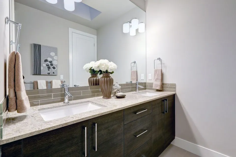
How to Pair a Backsplash Pattern With Marble Countertops
Marble countertops bring movement, depth, and natural variation to a kitchen or bathroom. Their veining may be delicate and cloudy, sharply linear, or dramatic enough to become the room’s main focal point. The backsplash should support that character without making the wall feel visually crowded.
The best backsplash design begins with the marble rather than with a favorite tile pattern. Examine the background color, vein direction, contrast level, finish, and slab layout. Then choose a backsplash material and arrangement that repeats one or two of those qualities in a quieter, more controlled way.
Pattern also affects the perceived size and mood of a room. A simple stacked layout can make a space feel calm and contemporary, while herringbone, chevron, or basketweave introduces rhythm. With careful planning, the backsplash can frame the countertop, cabinetry, range wall, and other architectural features as one cohesive composition.
Read the marble before choosing tile
Start by identifying the dominant visual feature of the countertop. White marble with soft gray veining usually works well with understated backsplash patterns, while marble with bold charcoal, gold, green, or rust-colored movement may need a simpler field tile. The goal is to recognize which element should command attention.
Look at the slab from several distances and under the lighting used in the room. A vein that seems subtle in a showroom may become prominent across a long countertop run. Likewise, a small mosaic sample may appear restrained in a hand-sized piece but become busy when repeated across an entire wall.
The countertop’s background color should guide the backsplash base. Warm marble often pairs naturally with ivory, cream, beige, taupe, or muted brass accents. Cool white and gray marble can coordinate with crisp white, pale gray, blue-gray, or charcoal. A close color relationship generally creates a quiet transition, while moderate contrast makes the backsplash more visible.
Match the pattern to the room’s visual energy
A straight stacked layout is one of the safest choices for marble countertops. Rectangular tiles placed in even horizontal or vertical rows create structure without competing with natural stone. This arrangement suits contemporary kitchens, narrow galley layouts, and bathrooms where clean lines are a priority.
A classic brick or running-bond pattern adds a little movement while remaining easy to coordinate. It is especially effective when the tile has a subtle texture or handmade variation. Keep the grout close to the tile color if the marble has dramatic veining; contrasting grout can create extra lines that distract from the stone.
Herringbone and chevron patterns provide more energy and direction. Herringbone uses staggered rectangular pieces and feels traditional, transitional, or tailored. Chevron tiles meet at consistent points to form a sharper zigzag and often suit modern spaces. These layouts work best when the tile colors are restrained and the marble itself has enough visual interest.
For a more decorative effect, consider basketweave, small geometric mosaics, or a framed accent panel behind the range. These patterns can add personality, but they should have a clear purpose. Repeating several decorative motifs across the same room can make the design feel fragmented rather than layered.
Coordinate color, finish, and grout
Color matching does not require an exact duplication of the countertop. In fact, trying to find a tile with identical veining can make small differences look accidental. Instead, select a backsplash that shares an undertone or a secondary color from the marble. A warm white tile may connect with cream-colored veining, while a soft gray tile can echo cooler mineral movement.
Finish changes how the pattern is perceived. Glossy ceramic or glass tile reflects light and can brighten a darker kitchen, though strong reflections may emphasize every joint. Honed porcelain, matte ceramic, and natural stone surfaces tend to look quieter and more grounded. A polished marble countertop paired with a polished backsplash may feel luxurious, but a matte wall finish can provide welcome contrast.
Grout color deserves the same attention as tile color. Matching grout visually softens the pattern and allows the marble to remain prominent. A slightly darker grout defines the layout and can emphasize brick, herringbone, or geometric arrangements. Very bright white grout may require more maintenance in cooking areas, while heavily contrasting grout can dominate a delicate backsplash.
Material selection matters in bathrooms as well as kitchens. Porcelain and ceramic provide broad pattern and color choices, and natural stone can create a coordinated, high-end look. In a bathroom renovation, details such as shower walls, niches, and transitions should be considered with the vanity backsplash; bathroom surface planning helps keep these elements visually connected.
Use scale and layout to control movement
Tile scale should relate to the size of the countertop and wall. Large-format slabs or oversized tiles create fewer grout lines and provide a calm backdrop for expressive marble. They can also make a small room feel more continuous, provided the installation surface is properly prepared and the layout is planned around outlets, corners, and cabinets.
Medium rectangular tiles are versatile because they can be installed in stacked, brick, vertical, or herringbone arrangements. They provide enough surface area for color variation to show while keeping the pattern legible. Small mosaics work well for curved areas, compact backsplashes, and decorative inserts, but their many grout lines may compete with strongly veined stone.
The direction of the pattern can subtly influence the room’s proportions. Horizontal layouts reinforce the width of a wall and can make a low kitchen feel broader. Vertical stacks draw the eye upward and work well beneath tall cabinets or on a wall with a high range hood. Diagonal and zigzag patterns create movement, so they are best used where a lively accent is intentional.
Consider how the pattern will meet the countertop edge, cabinet underside, window trim, and upper termination point. A full-height backsplash may showcase the marble and tile more effectively than a short strip, especially behind a range or sink. However, a partial backsplash can be appropriate when cabinetry, open shelving, or existing wall details need to remain visible.
Compare popular backsplash arrangements
The same tile can produce very different results depending on its layout. Before deciding, view larger samples or digital elevations that show the pattern beside the actual marble. A sample board should include grout, cabinet color, hardware finish, and lighting conditions whenever possible.
| Backsplash pattern | Overall effect | Best pairing with marble | Design consideration |
|---|---|---|---|
| Stacked horizontal | Clean, calm, contemporary | Softly veined white or gray marble | Keeps attention on the countertop |
| Running bond | Familiar, balanced, transitional | Marble with moderate movement | Grout lines remain visible but controlled |
| Vertical stack | Tall, tailored, modern | Low-contrast marble with linear veins | Draws the eye upward |
| Herringbone | Detailed, classic, energetic | Quiet marble with restrained color | Use a simple tile to avoid visual overload |
| Chevron | Sharp, graphic, refined | Minimal marble with strong directional veins | Precise installation is especially important |
| Basketweave | Decorative, traditional, textural | Honed or softly patterned marble | Works best as a focused accent |
| Large-format tile | Spacious, continuous, understated | Boldly veined or colorful marble | Requires careful wall preparation and layout |
Patterns should be evaluated in relation to the room’s other finishes. If the cabinetry has raised panels, decorative hardware, or visible wood grain, a restrained backsplash may provide needed balance. Flat-panel cabinets and simple fixtures can accommodate a more expressive arrangement without making the room feel overly ornate.
A focal-point pattern is often more successful than an all-over statement. For example, a herringbone panel behind the range can add distinction while the surrounding walls use a simple stacked tile. A stone frame, contrasting border, or change in tile orientation can define the cooking zone without competing with the entire countertop installation.
Connect the backsplash with surrounding finishes
A cohesive room usually repeats selected details rather than copying every finish. The backsplash might echo a gray vein in the marble, relate to the cabinet color, and complement the metal used on faucets and pulls. These connections create continuity while allowing each material to retain its own identity.
Hardware can help determine whether the design feels warm, cool, traditional, or modern. A marble countertop with warm veining may look especially inviting with aged brass, bronze, or champagne hardware. Cooler veining often coordinates with polished nickel, chrome, or stainless steel. The backsplash does not need to contain metallic elements, but its undertone should work comfortably beside them.
Wood tones also affect pattern selection. Natural oak, walnut, and painted cabinetry each bring a different level of visual texture. If the cabinets have pronounced grain, select a backsplash pattern with fewer interruptions. If the cabinets are solid and understated, a subtly varied tile or geometric layout can supply dimension.
Think beyond the immediate kitchen or bathroom. A custom backsplash may need to relate to a fireplace surround, an adjoining wet bar, an outdoor cooking area, or a connected living space. Projects involving custom surface features benefit from coordinated material planning so that marble, porcelain, tile, and other surfaces feel intentional across the property.
Plan the installation details early
A beautiful pattern can lose its impact if the installation is not carefully resolved. The layout should account for outlet placement, appliance dimensions, corners, window openings, and changes in wall depth. Centering the pattern on a focal point, such as a range hood or sink, often creates a more finished appearance than beginning with a random edge.
Ask how the backsplash will meet the countertop. A small joint or flexible sealant line is typically used where the two surfaces meet, allowing for slight movement and helping protect the wall. The countertop edge profile should also be considered, especially if the marble has a decorative ogee, bevel, or laminated edge.
Full-height installations require accurate measurements and thoughtful transitions. The tile may extend to the underside of upper cabinets, reach a ceiling-height hood, or continue around a window return. A fabricator or installer can help coordinate these dimensions with countertop templating, sink placement, edge details, and cutouts.
Bring home large samples whenever possible. Place them vertically against the marble and view them in morning, afternoon, and evening light. Compare the actual grout color, not just the tile surface, and check whether the pattern still looks balanced when viewed from the entryway or adjacent room.
Practical choices for a balanced design
Use these recommendations to narrow the options before making a final material decision:
- Choose a simple backsplash layout when the marble has dramatic, high-contrast veining or several visible colors.
- Select a moderate pattern, such as running bond or vertical stack, when the stone has noticeable movement but the cabinetry is relatively plain.
- Reserve herringbone, chevron, and decorative mosaics for focused areas unless the rest of the room is intentionally understated.
- Coordinate with the marble’s undertone instead of searching for an exact match to every vein.
- Review full-size samples with grout, cabinet finishes, lighting, and hardware before approving the installation.
The strongest designs usually establish a clear hierarchy: the marble may serve as the main feature, the backsplash may provide texture and rhythm, and the cabinetry may supply a calm frame. Reversing that hierarchy can work too, but it should be deliberate. A bold tile pattern paired with quiet marble requires restraint in cabinet color, hardware, and accessories.
Professional measurement and templating are especially valuable when the backsplash will meet custom countertops, integrated sinks, shower surfaces, or unusual wall conditions. Precision helps protect the pattern at corners and focal points, while material expertise can reveal how porcelain, ceramic, natural stone, and glass will behave during cutting and installation.
Marble countertops deserve a backsplash that feels considered from every angle. Begin with the stone’s color and movement, select a pattern that supports the room’s proportions, and test the complete combination before installation. For a tailored design in North Little Rock and surrounding areas, contact The Countertop Store to discuss material samples, fabrication details, measurements, and a backsplash layout that brings the entire space together.