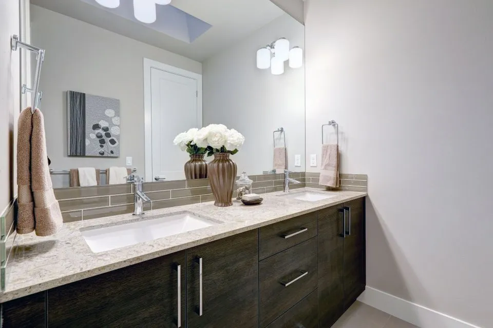
How to Choose a Countertop Color That Complements Your Flooring
Flooring establishes one of the largest visual fields in a kitchen or bathroom, so it strongly influences how every other surface appears. Countertops sit directly within that visual framework. When their color works with the floor, the room feels intentional, balanced, and easier to decorate. When the two surfaces compete, even high-quality materials can make the space feel disjointed.
Choosing a countertop color does not mean matching the floor exactly. In many successful remodels, the countertop complements the flooring through a shared undertone, a controlled contrast, or a repeated accent color. Quartz, granite, marble, porcelain, Dekton, soapstone, and butcher block each offer different ways to create that relationship.
The right choice also depends on cabinetry, wall color, backsplash design, natural light, and how the room will be used. A countertop fabricator can help you evaluate full-size material samples rather than relying on small showroom chips. This is especially useful when planning a custom kitchen or bathroom in North Little Rock, Arkansas, where the finished surface must suit both the home and the surrounding design.
Start with the flooring undertone
The first step is identifying whether your flooring has a warm, cool, or neutral undertone. Warm floors often include beige, cream, honey, tan, terracotta, or reddish brown. Cool floors may show gray, blue, green, or crisp white. Neutral flooring can bridge several color families, although it may still lean slightly warm or cool when viewed beside other materials.
Look at the floor in daylight, morning light, and evening lighting. Artificial bulbs can make a beige floor appear yellow or cause a gray floor to look noticeably blue. If your flooring contains several colors, identify the dominant background shade first, then note the secondary tones that could be echoed in the countertop veining.
A warm wood-look floor usually pairs well with cream quartz, warm white marble-look surfaces, beige granite, or soapstone with softer undertones. Cool gray tile can work with white quartz, gray-veined porcelain, charcoal granite, or a darker solid surface. If the floor is highly varied, a quieter countertop may create a more comfortable visual balance.
Decide between coordination and contrast
A coordinated palette uses related colors across the floor and countertop. This approach is effective when you want a calm, continuous appearance, especially in a smaller kitchen or bathroom. For example, a light greige floor can pair with a soft white countertop that has subtle taupe movement. The colors differ enough to define each surface while still feeling connected.
Contrast creates stronger boundaries. Dark countertops over light flooring can make an island or vanity feel substantial, while a pale surface over dark flooring can brighten the room. Contrast is most successful when another element repeats one of the colors. Dark hardware, cabinet accents, a backsplash detail, or pendant lighting can help connect a deep countertop to a lighter floor.
Avoid creating contrast in only one place. A dramatic black countertop with no other dark accents may appear isolated. Likewise, a bright white counter against medium-brown flooring can look stark if the walls, cabinets, and backsplash do not soften the transition. Repeating colors throughout the room gives the eye a path from one material to the next.
Match the visual movement, not just the color
Color is only part of the relationship between flooring and countertops. Pattern, veining, texture, and movement can be equally important. A floor with pronounced knots, grain, or stone variation may need a countertop with a restrained pattern. A simple floor can support a more expressive surface, such as heavily veined quartz, marble, or porcelain.
For example, patterned encaustic tile already acts as a focal point. A countertop with minimal veining can keep the room from becoming visually crowded. In contrast, plain large-format tile may provide a clean background for a dramatic waterfall island or a richly patterned granite perimeter.
Sheen also affects how colors interact. Polished countertops reflect more light and can make a darker material feel livelier. Honed or leathered finishes appear softer and may work especially well with matte flooring. Ask to view material samples beside an actual flooring piece, cabinet door, and backsplash sample. A single color chip cannot show how reflection and pattern will change across a full installation.
Use cabinets and backsplashes as the bridge
Cabinet color often determines whether the countertop-to-floor transition feels natural. White cabinets can connect to nearly any flooring, but the countertop should help establish whether the room feels warm, cool, classic, or modern. With light oak cabinets and warm flooring, a creamy quartz or softly veined granite may feel more integrated than a blue-white surface.
Gray cabinets can support both cool and warm countertops, depending on their undertone. A gray with blue content pairs naturally with crisp white quartz or cool marble-look porcelain. A greige cabinet may look better with a warmer white, beige, or taupe surface. Dark cabinetry generally benefits from a countertop that provides enough contrast to preserve definition around the work areas.
The backsplash can act as a visual buffer between the counter and upper wall. If the floor and countertop are already similar, a backsplash with gentle variation can keep the surfaces from blending into one mass. If the countertop has dramatic movement, choose a backsplash that borrows one subtle color rather than introducing an entirely new pattern.
| Flooring appearance | Countertop direction | Cabinet or backsplash support | Overall effect |
|---|---|---|---|
| Light warm wood or beige tile | Cream, warm white, taupe, or soft-veined quartz | Natural wood, ivory, bronze, or muted green accents | Welcoming and cohesive |
| Cool gray tile | White, gray, charcoal, or cool-veined porcelain | Gray, white, black, or brushed metal details | Clean and contemporary |
| Dark wood or slate | Light quartz, pale granite, or marble-look porcelain | Light cabinets and a restrained backsplash | Bright with clear contrast |
| Busy patterned tile | Quiet solid or lightly veined countertop | Simple cabinets and minimal accessories | Balanced and calm |
| White or pale neutral flooring | Medium or dark granite, soapstone, or quartz | Repeated dark hardware or lighting | Defined and dramatic |
| Terracotta or reddish flooring | Warm cream, brown, olive, or muted charcoal | Natural wood and earthy backsplash tones | Earthy and grounded |
Consider the room’s light and size
Natural light can change the apparent color of both flooring and countertops. A north-facing room often makes surfaces look cooler and dimmer, while strong southern or western light can emphasize warmth. A countertop that looks neutral in a showroom may read noticeably cream, gray, or pink in your home.
Small rooms typically benefit from medium-to-light surfaces that reflect available light. This does not mean every compact kitchen needs a white countertop. A pale gray, soft beige, or lightly patterned material can provide depth without making the room feel enclosed. Consistent flooring and countertop tones can also create visual continuity across a small footprint.
Large rooms provide more flexibility, though scale matters. A broad island can carry a stronger color or larger pattern than a narrow vanity. If you are designing a spacious kitchen with separate perimeter and island surfaces, consider using related materials in different tones. A light perimeter countertop and darker island can add definition while maintaining a coherent palette.
Select a material that supports the color choice
Quartz is a practical option for homeowners who want a controlled background color and predictable patterning. It is available in warm whites, cool whites, grays, taupes, dark solids, and marble-inspired designs. Its consistent appearance makes it easier to coordinate with a specific flooring undertone.
Granite offers natural variation, making it useful when you want to pull several flooring colors into the countertop. A slab may contain cream, gray, brown, black, or gold accents that connect cabinetry and flooring. Because each slab is unique, view the actual piece whenever possible before approving fabrication.
Porcelain and Dekton can provide dramatic stone-inspired looks, strong color consistency, and large-format applications. These materials may be especially useful for contemporary kitchens, shower walls, backsplashes, and fireplace surrounds. Marble brings distinctive veining and elegance, while soapstone contributes a deep, quiet color that develops character over time. Butcher block adds warmth and texture, particularly when paired with tile, painted cabinets, or wood flooring.
Material selection should also reflect maintenance expectations. A color that looks perfect may be impractical if it highlights crumbs, water spots, or daily wear more than you prefer. Discuss sealing, cleaning, edge profiles, heat exposure, and intended use with your fabricator before finalizing the surface.
Think beyond a simple color match
A countertop does not need to repeat the floor’s most obvious color. Sometimes it is more effective to select a surface that picks up a minor undertone. A floor with beige and gray variation might pair beautifully with a neutral quartz that emphasizes the gray, especially if the cabinets or backsplash repeat the beige.
You can also use design details to create a relationship between unrelated materials. A waterfall edge, contrasting island, matching backsplash, or custom mantel can make the entire home feel more connected. In bathrooms, an integrated sink can help the vanity look like one continuous surface; a seamless vanity sink is particularly effective when you want the countertop color and basin to read as a unified feature.
Do not overlook edge profiles and surface transitions. A simple eased edge keeps attention on the material itself, while a more decorative profile can support traditional flooring and cabinetry. In an open-plan home, repeating one countertop material at a bar, fireplace, or furniture piece may extend the color story beyond the kitchen.
Practical ways to narrow your choices
Before visiting a showroom or selecting a slab, gather physical samples from the room. Include a flooring sample, cabinet door, backsplash tile, paint swatch, hardware finish, and any wood tone that will remain. Compare them vertically and horizontally because countertops are viewed from multiple angles.
Use these recommendations to make the process more manageable:
- Identify the floor’s dominant undertone before choosing a countertop color.
- Compare full-size samples in both natural and artificial light.
- Balance a busy floor with a quieter counter, or let a simple floor support more movement.
- Repeat at least one countertop color in the cabinets, backsplash, hardware, or lighting.
- Consider cleaning needs, sealing requirements, and daily wear alongside appearance.
A professional measurement and templating appointment can reveal details that samples cannot, including seams, overhangs, sink placement, wall irregularities, and how a pattern will flow across an island. Fabricators can also explain which materials are suitable for shower walls, quartz shower pans, outdoor kitchens, fireplaces, and other custom applications.
The strongest countertop decisions are made as part of the complete room rather than in isolation. At The Countertop Store, homeowners in North Little Rock and nearby Arkansas communities can review material options, coordinate colors with existing flooring, and plan fabrication details for kitchens, bathrooms, and custom surfaces. Bring your flooring and cabinet samples to begin shaping a countertop palette that feels intentional from the first step into the room.