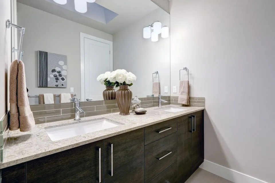
Coordinating Countertops with Custom Cabinet Colour Schemes
Pairing benchtops with cabinetry is one of those decisions that can make or break a kitchen, and most renovators only get one shot at it. The right combination pulls a room together, while a mismatched choice can leave even premium materials looking awkward. Australians planning a reno often spend months agonising over the perfect splashback tile or the right shade of cabinetry, then realise the benchtop selection has to work in harmony with all of it.
The challenge is that cabinetry, benchtop material, splashback, edging, and even lighting all need to speak the same design language. A pale coastal kitchen in a Surfers Paradise apartment will rarely share a palette with a heritage renovation in a Federation home in Adelaide, even when both owners are drawn to the same "modern classic" look. This guide walks through the practical principles, material considerations, and local realities that shape a cohesive pairing.
| Cabinet Colour | Recommended Benchtop | Visual Effect |
|---|---|---|
| Crisp white (Polytec, Laminex) | Soft grey quartz with subtle veining | Coastal, airy, family-friendly |
| Matte charcoal or black | Warm white marble-look porcelain | Modern contrast, dramatic |
| Natural timber veneer | Cream or beige engineered stone | Warm, earthy, lived-in |
| Sage green or eucalyptus | White quartz with soft gold veining | Hamptons, heritage feel |
| Navy or deep blue | Pale grey stone or soft cream | Bold, classic, balanced |
| Two-tone (light uppers, dark base) | Neutral mid-tone with movement | Layered, contemporary |
Reading Undertones Before You Pick a Stone
Every cabinet paint, laminate, or timber carries an undertone that quietly influences how a benchtop will read in the room. Australians picking up a sample card at a Bunnings warehouse or flicking through a Laminex catalogue often see "white" or "grey" as one option, but the reality is that whites lean cool (blue, grey, lilac), warm (cream, butter, pink), or somewhere neutral. The same applies to greys, which can swing green, blue, or taupe depending on the light.
A quick trick is to hold cabinet samples next to a piece of white paper in natural daylight. If the sample looks yellowish, pinkish, or creamy, it is warm. If it looks bluish, it is cool. Neutral whites sit right on the paper without obvious colour shift. Once the undertone is identified, the benchtop should either match the temperature or provide a deliberate, pleasing contrast. Pairing a cool blue-grey cabinet with a creamy, beige stone tends to feel unresolved, while matching temperatures creates instant harmony.
The Australian sun is harsher than most people expect, especially in western-facing kitchens in suburbs like Parramatta or Penrith. UV light amplifies warm undertones, so a cream cabinet that looks subtle in a showroom can read quite yellow by the arvo in a sun-drenched room. Quartz and porcelain handle this more consistently than natural marble, which can develop a patina over time. For north-facing rooms, it pays to view samples at midday and again in late afternoon light before committing.
Contrast, Harmony and Visual Weight
The most enduring kitchen schemes rely on either a confident contrast or a soft, tonal harmony. A high-contrast pairing — dark cabinetry with pale stone, or pale cabinetry with deep, dramatic veining — feels modern and architectural. A tonal pairing, where cabinet and benchtop sit within the same colour family, feels calm and considered. Neither is wrong, but they suit very different homes.
Visual weight matters just as much as colour. A heavy, dark-veined granite on a small island in a Queenslander renovation can overpower the room, while a whisper-thin quartz with soft movement lets the cabinetry lead. On the flip side, a heavy timber cabinet in a country-style kitchen in the Yarra Valley looks balanced when paired with a substantial stone, because the eye expects weight to match weight.
A common local mistake is choosing a busy, dramatic stone for the benchtop and then adding a patterned splashback. In Australian open-plan homes, where the kitchen often flows into a living and dining zone, this creates visual noise. A simpler approach is to let one element carry the drama — the benchtop, the splashback, or a feature pendant — and keep the rest as supporting players.
Matching Stone Families to Cabinet Finishes
Different materials bring different design personalities. Quartz, with its engineered consistency, suits contemporary and Hamptons-style homes across Sydney's eastern suburbs and Melbourne's bayside. Granite, with its natural movement and depth, pairs beautifully with traditional or transitional cabinetry, including the painted timber kitchens common in older Adelaide and Hobart homes. Porcelain slabs, a relatively newer option locally, offer incredible durability and can mimic marble, concrete, or even weathered steel.
Marble-look surfaces remain hugely popular in Australia, particularly in renovated heritage homes where owners want the look of Calacatta without the maintenance. These pair elegantly with soft greys, warm whites, and muted blues. Dekton, another engineered surface, is gaining traction in outdoor kitchens and alfresco areas — a significant consideration for Aussies who entertain outside for much of the year.
Butcher block and timber benchtops sit in a different category. They work best with painted cabinetry in solid colours rather than with timber veneer cabinets, which can feel redundant. A painted sage-green island with a warm timber benchtop, for instance, is a classic pairing seen in renovated country kitchens throughout the Southern Highlands.
Working with Timber and Two-Tone Cabinetry
Timber-look cabinetry has surged in popularity across Australia, partly thanks to brands like Polytec offering convincing woodgrain laminates in oak, blackbutt, and spotted gum. These finishes work wonderfully with stone benchtops, but the choice of stone should complement the timber's character. A pale oak cabinet calls for a warmer, creamier benchtop to avoid feeling cold, while a richer blackbutt or walnut cabinet can carry a cooler white or grey stone.
Two-tone kitchens — usually lighter uppers and a darker base or island — are everywhere in new Australian builds, particularly in the family-oriented estates popping up around Campbelltown, Cranbourne, and the outer suburbs of Perth. The benchtop in a two-tone scheme usually needs to be neutral enough to bridge both cabinet colours. A mid-tone engineered stone with soft movement does this job well, whereas a stark white or deep charcoal can make the two cabinet shades feel like they're arguing with each other.
If the kitchen includes a feature island in a contrasting colour, consider continuing the benchtop across both the perimeter and the island. Splitting the benchtop material can break the visual flow and make the space feel choppier, especially in galley or L-shaped layouts common in suburban Australian homes.
Edging, Veining and the Details That Tie It Together
Once the broad colour and material decisions are made, the smaller details carry surprising weight. Edge profiles — the way the benchtop is finished at the front and around cutouts — change how the whole surface reads. A sharp, square edge amplifies modernity, while a bullnose or bevelled edge softens the look. For a thorough look at the options and how they suit different stone types, choosing the right edge profile is worth a closer read before templating begins.
Veining direction is another quietly powerful decision. Running veining horizontally on a long island can make the benchtop feel stretched and calm, while running it vertically creates movement and drama. Matching the veining direction to the cabinet grain or the floorboards creates a sense of intentionality that lifts a kitchen from "nice" to "considered".
Don't overlook the splashback as a connector. A splashback that picks up a secondary colour from the benchtop — perhaps the gold veining in a quartz island, or the soft grey in a porcelain perimeter — links the two surfaces visually. In Australian homes where the kitchen opens to an outdoor entertaining area, extending the same stone up the wall as a splashback or wrapping it around a window reveals a luxurious, hotel-like finish.
Common Australian Pairings That Endure
While every home is different, a handful of pairings show up again and again in renovated Australian kitchens. White cabinetry with light grey quartz and a marble-look splashback remains a perennial favourite, particularly in apartments and townhouses along the east coast. Charcoal cabinetry with a warm white stone and brushed brass handles delivers a more moody, sophisticated feel suited to inner-city renovations.
Sage green cabinetry with cream or beige stone has become a quiet hero of the past few years, working across Hamptons, country, and contemporary styles. Navy cabinetry with pale grey or soft white stone is a bolder choice that suits period homes and coastal properties alike. Timber-look cabinetry with a neutral mid-tone stone — often with subtle veining — remains the safest, most versatile choice for family homes and investment properties where longevity matters.
A good rule of thumb is to choose the benchtop second, after the cabinetry palette is settled, but before the splashback tile is locked in. That sequence gives the splashback room to respond to both, rather than competing with either. The result is a kitchen that feels calm, intentional, and built to last well beyond the next trend cycle.
Practical Recommendations for a Cohesive Pairing
A good kitchen pairing isn't just about colour theory — it involves the practical realities of the Australian renovation market. Lead times for fabricated stone can stretch to several weeks during peak building season, and templating only happens after cabinetry is installed. That ordering sequence matters: cabinetry first, then templating, then stone fabrication, then installation. Rushing the order usually leads to costly errors.
Order physical samples, not just digital swatches. Photos on screens never quite capture the depth of natural stone or the subtle warmth of a timber veneer. Most Australian suppliers will send a small offcut for a small fee, and a few days with the sample on the actual benchtop or cabinet door is invaluable.
If you're working with a designer, builder, or consultant, ask them to mock up a small section of the kitchen — even just a 600mm x 600mm corner — to see how the cabinet, benchtop, and splashback interact. Some renovation teams offer 3D renders; others can supply a physical board. Either way beats relying on imagination alone. For those still gathering ideas and looking at broader home design resources, renovation inspiration galleries can be a useful starting point, even though the trends across hemispheres don't always translate directly.
Lighting deserves a final mention. The same benchtop can look completely different under cool LED downlights, warm filament globes, or the late-afternoon sun streaming through a west-facing window. Australian homes increasingly use layered lighting — task, ambient, and accent — and the benchtop should be reviewed under all three conditions before the final sign-off. Following a few reliable guidelines tends to make the difference between a kitchen that photographs well on day one and one that still feels considered a decade later.
- Choose a benchtop whose undertone matches or deliberately complements the cabinet undertone
- View all samples in the actual room at different times of day before committing
- Keep the splashback, benchtop, and cabinetry in conversation rather than competition
- Match edge profile and veining direction to the overall design language
- For two-tone kitchens, run one continuous benchtop material across both cabinet colours
- Order physical samples and live with them for at least a few days
- Final review under all three lighting conditions — daylight, task, and ambient