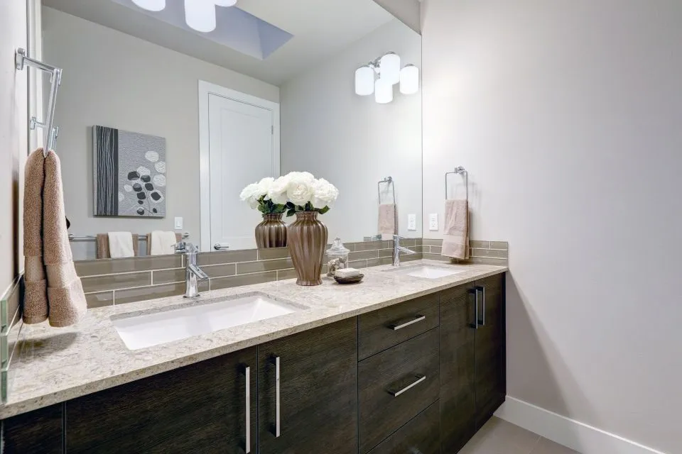
A Thoughtful Guide to Coordinating Countertops and Color
Countertops, cabinets, and wall paint occupy much of a kitchen or bathroom’s visual space, so their relationship strongly influences the finished design. When these surfaces share compatible undertones and contrasting levels of depth, the room feels intentional rather than assembled from separate selections.
The right combination does not require every finish to match. In fact, a successful palette usually includes variation in color, texture, pattern, or sheen. The goal is to create enough contrast for each feature to stand out while keeping the overall room visually connected.
Cabinet color should usually guide the direction of the design, while wall paint supports the larger composition. Countertops then act as the bridge between the two, carrying shared tones, introducing a focal pattern, or adding warmth to a space that needs balance.
Use Existing Finishes as Your Starting Point
Begin with the elements that are expensive or difficult to replace. Cabinets, flooring, tile, appliances, and existing backsplashes should be evaluated before choosing a countertop or paint color. If the cabinetry is staying, its color and undertone become the foundation for the new surface palette.
White cabinets can range from crisp blue-white to creamy ivory. Gray cabinets may carry blue, green, violet, or brown undertones. Wood cabinetry varies from pale oak and maple to reddish cherry, golden walnut, and deep espresso. These subtle differences affect which countertop colors will look natural beside them.
Flooring deserves equal attention because it often covers more area than expected. A warm wood floor may make a cool gray countertop appear stark, while a cool stone floor can help balance a warmer cabinet finish. Look at cabinetry and flooring together before judging a countertop sample.
If the room includes a dramatic backsplash, fireplace surround, or patterned tile, consider whether the countertop should remain quiet. A restrained quartz or softly veined marble-look surface can prevent several competing focal points from overwhelming the space.
Read Undertones Before Choosing a Slab
Undertones are the subtle colors beneath the dominant surface color. A countertop that appears white may contain cream, gray, taupe, blue, or green. Identifying that hidden color is one of the most useful steps in coordinating kitchen countertops with cabinet colors and wall paint.
Warm undertones generally work well with cream cabinets, natural wood, beige walls, terracotta accents, and brass hardware. Cool undertones often complement bright white cabinets, blue-gray cabinetry, black fixtures, and clean, contemporary paint colors. Neutral surfaces such as soft greige or balanced gray can connect several finishes when the room contains both warm and cool elements.
Natural stone requires special attention because its appearance can shift across the slab. Granite and marble may include veins or mineral movement in several related shades. Quartz offers more predictable consistency, while porcelain and Dekton can create bold stone-inspired patterns with a contemporary feel. Viewing a small sample is useful, but a full slab provides a more accurate impression of scale and variation.
Paint should be selected after the countertop and cabinet relationship is reasonably clear. Hold paint cards beside the actual slab rather than relying on memory or online images. Daylight, warm bulbs, and nearby flooring can each change how the colors are perceived.
Balance Color Across the Room
A room usually feels more cohesive when a countertop color appears in at least one additional place. A gray vein might connect to wall paint, cabinet hardware, flooring, or a nearby upholstered piece. A warm taupe background can be echoed in a backsplash grout color or wood accent. This repetition creates continuity without making the kitchen look overly coordinated.
Contrast remains important. Light countertops against medium or dark cabinets produce definition and help the work surface stand out. Dark countertops with light cabinets create a grounded appearance, particularly when paired with dark hardware or lighting. Similar values can create a calm, monochromatic room, though texture and edge detail become more important when color contrast is limited.
For a kitchen island, consider how the surface will look from adjoining rooms. The island often serves as furniture as much as a work area, so a waterfall edge, bold veining, or contrasting slab may make sense. If the island is the visual centerpiece, a full surface can preserve the movement of the pattern. This full-slab guidance explains why a single slab is often preferred over a seam for this feature.
In a bathroom, the same principle applies to the vanity top, shower walls, quartz shower pan, and backsplash. Repeating one material across several surfaces can make a compact room feel larger, while a contrasting vanity top can add character to a simple tile scheme.
Match Material Character to Your Design
Color is only one part of coordination. The material’s visual character should suit the cabinet style, wall color, and use of the room. Polished quartz with subtle veining supports a refined transitional kitchen, while leathered granite introduces a tactile quality that works well with natural wood and darker cabinetry.
Marble can add distinctive movement and a classic appearance, though its veining should be considered alongside wall patterns and backsplash tile. Soapstone provides a soft, deep look that pairs comfortably with painted cabinets and traditional spaces. Butcher block brings warmth and can soften a kitchen dominated by white, gray, or black surfaces.
Porcelain and Dekton are useful when a homeowner wants a large-format, contemporary appearance with strong visual impact. Their patterns may resemble marble, concrete, or other stones, allowing the surface to serve as a defining design element. If the slab pattern is bold, simpler cabinet doors and quieter wall paint usually create the best balance.
Finish also changes the way color is experienced. A polished surface reflects light and can make a color appear brighter, while a honed or matte finish produces a softer, more muted effect. Compare sheen levels across the room so a glossy countertop does not compete with highly reflective tile or appliances.
Compare Combinations Before You Commit
A side-by-side comparison is more reliable than choosing each finish separately. The following combinations offer a starting point, but lighting, flooring, room size, and material variation should guide the final decision.
| Cabinet color | Countertop direction | Wall paint approach | Design effect |
|---|---|---|---|
| Bright white | Soft gray quartz or lightly veined marble | Warm white, pale greige, or muted blue-gray | Clean with gentle contrast |
| Cream or ivory | Warm quartz, granite, or quartzite | Beige, mushroom, or soft sage | Comfortable and traditional |
| Natural oak | White quartz, soapstone, or earthy granite | Warm white, muted green, or clay-inspired neutral | Organic and welcoming |
| Blue-gray | White, gray, or subtly warm stone | Soft white, pale taupe, or dusty blue | Calm and layered |
| Charcoal or black | Light quartz, marble-look porcelain, or butcher block | Warm white or light greige | Dramatic with visual lift |
| Medium walnut | Cream stone, leathered granite, or warm quartz | Light beige, olive-gray, or balanced white | Rich and grounded |
| Green cabinetry | Cream quartz, natural marble, or light granite | Warm white, sand, or muted beige | Collected and connected |
When reviewing options, place cabinet, countertop, backsplash, flooring, and paint samples together. Arrange them vertically and horizontally when possible because a countertop viewed flat may appear different from a backsplash or wall viewed upright. Include hardware and faucet finishes in the grouping if they are already selected.
Evaluate the samples at different times of day. Morning light may emphasize cool tones, while afternoon light can bring out warmth. Recessed lighting and under-cabinet fixtures also influence the appearance of a countertop. A combination that works in a showroom may look noticeably different in the actual room.
Build a Finish Plan That Works in Real Life
A coordinated design should support daily use as well as visual appeal. Consider cooking habits, cleaning preferences, traffic, and maintenance before selecting a surface. Some homeowners prioritize a nearly uniform quartz pattern, while others prefer the natural variation of granite, marble, or soapstone.
Custom fabrication also affects how a material contributes to the room. Edge profiles, seams, sink integration, overhangs, and backsplash height can change the visual weight of the countertop. An integrated sink may create a streamlined appearance in a bathroom, while a substantial edge can make a kitchen island feel more like a piece of furniture.
A practical selection process can keep the palette focused:
- Identify the fixed finishes that will remain, including flooring, cabinets, appliances, and tile.
- Collect large samples of countertop materials and compare their undertones in the actual room.
- Choose wall paint after the countertop and cabinet relationship has been established.
- Limit the room to one primary focal pattern and use quieter surfaces around it.
- Review slab layout, edging, backsplash transitions, and sink details before fabrication.
Professional measurements and templating are especially valuable when the design includes an island, unusual wall angles, full-height backsplash material, or a custom shower installation. A fabrication team can show how veining will travel across adjoining pieces and where seams or cutouts will occur.
At The Countertop Store, homeowners in North Little Rock and surrounding Arkansas communities can coordinate material selection with measuring, templating, fabrication, edging, and installation. The same planning approach can extend to fireplaces, mantels, outdoor kitchens, furniture pieces, and other custom surfaces so the finishes throughout the home feel related.
The most successful color palettes leave room for variation while maintaining a clear visual direction. Let cabinet color establish the foundation, use wall paint to support the atmosphere, and choose a countertop that connects the two through undertone, pattern, or texture. Bring your cabinet and paint samples to The Countertop Store to review material options, slab movement, edge details, and installation requirements for a finished design that feels considered from every angle.