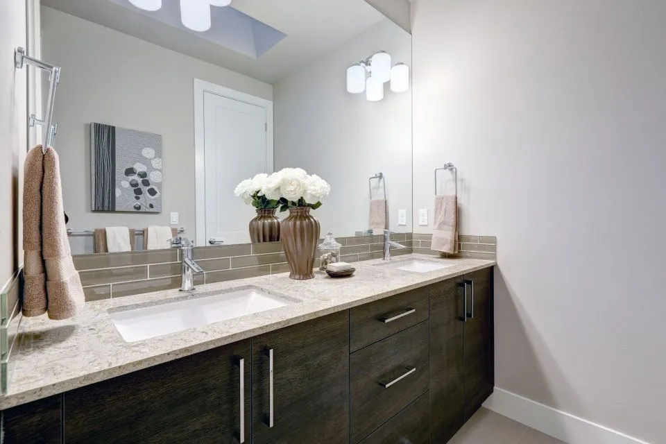
Coordinating Your Kitchen Countertop With Backsplash Pattern
When you're remodelling a kitchen in a Brisbane Queenslander or a single-fronted Victorian in Melbourne's inner north, the relationship between your benchtop and splashback shapes how the whole room feels. These two surfaces occupy the largest continuous visual real estate in the cooking zone, so a thoughtful pairing can lift the space from ordinary to quietly memorable. Australians are spending more time at home than ever, and kitchens now double as homework hubs, entertaining zones, and breakfast bars, which means every finish has to work harder.
A coordinated benchtop and splashback aren't simply about matching colours. They need to handle splashes, heat, scrubbing, and the relentless Australian sun pouring through west-facing windows. The aim is a kitchen that looks composed, ages gracefully, and reflects the way you actually live, whether that means Sunday pancake breakfasts for the kids or long lunches with friends gathered around the island bench while someone mans the barbecue out the back.
Begin With a Clear Colour Story
Colour is the first decision, and it sets the tone for everything that follows. Most Australian homeowners lean toward warm whites, soft greys, sandy beiges, and charcoal anchors, partly because these tones pair easily with timber flooring and the eucalypt hues common in contemporary Australian joinery. If you start by identifying one dominant tone and one supporting accent, you can mix and match surface materials without the room feeling chaotic. A warm cream engineered stone benchtop, for instance, might sit beautifully against a soft sage, muted clay, or milky white subway splashback.
Stone brands popular on Australian benchtops include Caesarstone, which was founded locally and remains widely available, along with international names like Silestone, Dekton, and a growing range of locally fabricated porcelain slabs. When you explore stone options at a showroom, it pays to bring splashback samples with you so the two surfaces can be viewed side by side under the same lighting conditions. Daylight in Sydney's eastern suburbs looks quite different from the cooler light in a Hobart kitchen, and colour shifts more than you'd expect between artificial downlights and afternoon sun.
A useful rule to anchor your thinking is the 60-30-10 approach: 60 percent of the kitchen in your primary tone, 30 percent in a secondary, and 10 percent as an accent. In practice, this might mean the benchtop and cabinetry form the dominant 60 percent, the splashback and flooring take the 30 percent, and small details like handles, tapware, or a feature pendant handle the remaining 10 percent. Sticking to a deliberate ratio stops the finished room from drifting into a busy patchwork.
Match Pattern Scale to Visual Calm
Pattern scale is where many kitchens go wrong. A heavily veined marble-look quartz benchtop paired with a busy Moroccan or encaustic splashback tile can feel exhausting to look at, especially in compact kitchens common in newer Sydney apartments. Conversely, a plain solid-colour benchtop next to a large-format slab splashback reads as calm and architectural. The goal is contrast rather than competition, with one surface leading and the other supporting.
If your chosen benchtop already carries movement, such as the dramatic veining found in Calacatta-style porcelain or book-matched quartz, keep the splashback quiet. A simple handmade-look subway in a tone drawn from the lightest vein creates a sophisticated, gallery-like effect that lets the stone breathe. If the benchtop is calm, you have more freedom with the splashback: a patterned zellige, a finger mosaic, or a printed porcelain slab can become the visual hero without overwhelming the room.
In Australian homes, where open-plan layouts flow kitchen sightlines directly into living and dining zones, this contrast becomes even more important. A splashback that competes with a busy lounge rug, a feature wall in the adjacent room, or artwork quickly becomes visual noise. Designers working on renovations in Adelaide and Perth regularly cite the principle of "one statement per view", which gives the eye somewhere to rest and prevents the heart of the home from feeling cluttered.
Read the Light Your Kitchen Actually Receives
Light transforms both colour and pattern, and Australian homes span dramatically different conditions. A north-facing kitchen in Darwin receives intense, direct light for much of the day, which can wash out pale tones and exaggerate warm undertones in stone. A south-facing kitchen in a renovated Victorian in Fitzroy sees cooler, more consistent light that flatters blues and greens but can make warm beiges look flat or muddy. Before committing to a pairing, observe your kitchen at three times of day: morning, midday, and early evening.
Under-cabinet lighting, now standard in most new Australian builds, adds another layer of complexity. Warm 2700K downlights bring out honey tones in timber and stone, while cooler 4000K bulbs make whites crisper and more clinical. If your splashback has any reflective quality, such as a glazed ceramic, glass, or polished porcelain, it will pick up and multiply this under-cabinet glow, sometimes more aggressively than anticipated.
Gloss finishes bounce light around and can make small kitchens feel larger, an advantage in inner-city apartments where every centimetre counts. Matte or honed finishes absorb light and lend a softer, more contemporary feel, often preferred in the newer build estates popping up around Campbelltown or Cranbourne where open-plan family living dominates. Choosing between gloss and matte should come after you've seen both options in your own kitchen, not just under showroom fluorescents.
Think About Climate, Wear, and Local Conditions
Australia's climate is varied and sometimes unforgiving, and your benchtop-splashback pairing needs to perform in real conditions rather than on a sample card. In coastal areas such as the Gold Coast, Geelong, or the Mornington Peninsula, salt air can affect certain natural stones and metal trims, so choosing a non-porous quartz or porcelain makes sense for both the benchtop and the splashback. Engineered quartz resists staining from coffee, red wine, beetroot, and turmeric, which is helpful for households that entertain often or cook with bold spices.
Strata-titled apartments in Melbourne and Sydney have specific rules under the National Construction Code, particularly around wet-area waterproofing. Splashbacks in cooking zones are governed by Australian Standard AS 3958 for tile installation, while full wet walls behind sinks or ranges must meet AS 3740 waterproofing requirements. A reputable fabricator and tiler will know these standards and can advise on compliant substrates, which becomes critical when the splashback doubles as a full-height feature wall behind a freestanding cooker.
Everyday Australian habits also influence material choices. The barbecue culture and love of fresh produce mean benchtops double as chopping stations and buffet servers, and splashbacks often get splattered with olive oil, tomato sauce, and curry pastes. Smooth, non-porous surfaces with minimal grout lines keep cleaning quick between rounds of guests. Smaller-format tiles look lovely but require more maintenance around the grout, particularly behind a hardworking cooktop or in households with teens who treat the kitchen as their personal café.
Finish With Edging, Grout, and a Considered Transition
The final layer of coordination sits in the details: edge profiles, grout colour, and the way the benchtop meets the splashback. A waterfall end on an island bench reads differently when the splashback above is busy versus calm, so the edge profile and the splashback pattern should be planned together rather than chosen in isolation. Pencil rounds, mitred aprons, shark-nose edges, and double-thickness stacked edges each interact with patterns in distinct ways, and a wrong combination can undercut an otherwise beautiful pairing.
Grout choice can quietly make or break a design. A pale grout against a white splashback feels seamless and expansive, ideal for small kitchens where you want the walls to recede. A contrasting charcoal grout frames each tile and adds rhythm, working well with handmade-look ceramics that have a bit of wobble and variation. If your splashback tiles have natural colour variation, a grout colour matched to the dominant tone lets the tiles blend together as a textured surface rather than a graphic pattern.
Many homeowners underestimate how much professional help matters at this final stage. Templates need to be accurate, particularly when a splashback runs into a window reveal, meets a stone slab return, or wraps around a corner into a pantry. Engaging a fabrication team that handles both benchtop and kitchen surfaces under one roof reduces the risk of mismatched measurements and ensures the stone arrives ready for a seamless install. When the benchtop, splashback, edging, and grout all speak the same visual language, the kitchen stops feeling like a collection of parts and starts reading as a single, considered space shaped around the way Australians actually live, cook, and gather.