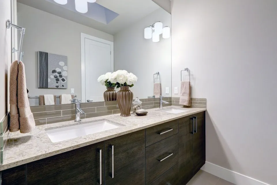
How to coordinate quartz countertops with cabinet hardware
Quartz countertops provide a broad design foundation for a kitchen or bathroom. Their color, veining, texture, and edge profile influence how the entire room feels, while cabinet hardware adds smaller but highly visible details. When these elements work together, the space looks intentional rather than assembled from unrelated selections.
The best pairing does not require every finish to match exactly. In many well-designed rooms, the countertop and hardware share an undertone, repeat a color found elsewhere, or create a balanced contrast. The goal is to establish a visual relationship between the surfaces and the fixtures without making the room feel overly coordinated.
Because quartz can resemble marble, concrete, limestone, or other natural materials, its appearance may change under different lighting conditions. Samples should be viewed beside cabinet doors, flooring, backsplash material, plumbing fixtures, and hardware before the final order is placed.
Start with the quartz undertone
Quartz countertops are often described with broad color names such as white, gray, beige, or black. Those labels are useful, but the underlying undertone usually has a stronger effect on hardware coordination. A bright white quartz may lean cool blue, soft gray, warm ivory, or even greige. Gray quartz can contain blue, green, brown, or taupe notes.
Look closely at the veining and background color. A countertop with warm cream movement generally works well with brass, antique brass, bronze, or champagne hardware. Cool white quartz often pairs naturally with polished chrome, brushed nickel, or matte black. A slab that combines warm and cool details gives you more flexibility, provided the other finishes are chosen with restraint.
Place a physical quartz sample beside the cabinet finish and hardware sample in both daylight and evening lighting. Artificial bulbs can make warm metals look more yellow and cool surfaces look bluer. A combination that appears balanced in a showroom may look noticeably different near a window or beneath under-cabinet lighting.
Match the hardware finish thoughtfully
Hardware finish affects the character of a room as much as its color. Polished brass adds brightness and formality, while brushed brass has a softer, more relaxed appearance. Matte black creates crisp definition, and oil-rubbed bronze brings depth to traditional or rustic interiors. Brushed nickel and satin chrome offer versatile neutral options.
The finish does not have to be an exact match for the countertop. Instead, consider whether it supports the slab’s visual temperature and style. For example, a white quartz with subtle gray veins can work with black pulls if the room includes dark window frames, lighting, or plumbing fixtures. The same countertop may feel gentler with brushed nickel in a space built around pale wood cabinets.
Pay attention to sheen as well as hue. A highly reflective countertop surface can look especially polished beside glossy chrome or polished brass. If the quartz has pronounced movement, a low-sheen hardware finish may keep the room from becoming visually busy. Matte and satin finishes can also soften a design that contains several reflective surfaces.
Use contrast to create a deliberate look
Contrast helps cabinet hardware stand out against both the cabinet doors and the countertop. Light quartz with medium or dark pulls creates clear definition, while dark quartz with light metal hardware produces a more dramatic effect. Medium-tone countertops can support either direction, depending on the cabinet color and the amount of natural light.
A high-contrast combination is often effective in contemporary kitchens. White quartz, deep green cabinets, and matte black hardware create strong architectural lines. For a softer result, pair warm white quartz with light oak cabinetry and champagne bronze pulls. The difference between the materials remains visible, but the overall palette feels connected.
If the countertop has bold veining, consider quieter hardware. Strong black, gold, or bronze fixtures can compete with dramatic marble-look quartz when both contain heavy visual weight. With a subtle quartz pattern, hardware can carry more of the decorative emphasis and become a defining feature on otherwise simple cabinetry.
| Quartz appearance | Hardware pairings to consider | Overall effect |
|---|---|---|
| Bright white with cool gray veins | Brushed nickel, polished chrome, matte black | Clean, crisp, contemporary |
| Warm white or ivory | Champagne bronze, brass, soft black | Welcoming and refined |
| Beige, taupe, or greige | Aged brass, bronze, brushed nickel | Comfortable and transitional |
| Dark gray or charcoal | Polished brass, satin brass, chrome | Dramatic with a polished accent |
| Concrete-look gray | Matte black, stainless, brushed nickel | Minimal and industrial |
| Marble-look quartz with bold veins | Simple brass, chrome, or black pulls | Lets the slab remain the focal point |
Account for the whole room
Cabinet hardware is one part of a larger finish scheme. Faucets, sink accessories, pendant lights, appliances, towel bars, mirrors, and door hardware all contribute to the room’s metal palette. Coordinating quartz with cabinet pulls becomes easier when these related elements are considered at the same time.
Using one dominant metal throughout the room is the simplest approach. A kitchen might use brushed brass for cabinet pulls, the faucet, and lighting accents. A bathroom could repeat matte black across the vanity, shower enclosure, mirror frame, and plumbing fixtures. Repetition makes the choices feel purposeful and reduces visual clutter.
Mixed metals can work when each finish has a clear role. For instance, brushed nickel may serve as the primary finish while matte black appears in lighting and cabinet hardware. Mixing two or three metals is more successful when the finishes are repeated and the countertop acts as a neutral bridge. Avoid adding a new metal for every individual fixture.
The backsplash deserves special attention because it sits directly between the quartz countertop and upper cabinets. A backsplash with warm veining can help connect brass hardware to a cooler countertop. A plain backsplash may allow the quartz and hardware to remain the primary design features. Reviewing the available countertop materials can help clarify how quartz compares with porcelain, granite, marble, and other surface options before the palette is finalized.
Consider cabinet color, room size, and lighting
Cabinet color changes the way both quartz and hardware are perceived. White cabinets make subtle countertop undertones easier to see, while painted blue, green, or charcoal cabinetry can make neutral quartz feel warmer or cooler. Natural wood cabinets add their own grain and golden, red, or brown notes to the palette.
In a small room, excessive contrast can make each component appear disconnected. A similar-value countertop and cabinet combination, paired with modest hardware contrast, often creates a calmer visual field. Larger kitchens and bathrooms can support stronger differences between the slab, cabinetry, and metal accents without feeling crowded.
Lighting should be evaluated early rather than after installation. North-facing daylight may emphasize cool tones, while warm recessed lighting can bring out cream and beige. Under-cabinet lights highlight the countertop edge and backsplash, making reflective hardware appear brighter. Ask to view samples under the lighting temperatures planned for the finished room.
Scale matters, too. Oversized pulls make a bold statement and may suit large drawers or wide islands. Small knobs and short pulls can look refined on compact cabinetry but may disappear against a busy quartz pattern. The hardware’s length, shape, and spacing should relate to the cabinet dimensions as well as the surface colors.
Build a finish plan before fabrication
A finish plan prevents small decisions from becoming expensive surprises. Begin with the quartz slab or a representative sample, then place it beside cabinet doors, hardware, backsplash samples, flooring, and plumbing fixtures. Photograph the arrangement in different rooms and lighting conditions, but use the physical samples for the final assessment.
The countertop edge profile can influence the design’s formality. A simple eased or pencil edge supports a modern look and allows the hardware to provide visual detail. A more decorative edge may suit traditional cabinetry, especially when paired with warm metals and classic door styles. The edge should complement the hardware rather than compete with it.
Vein direction and slab layout also deserve attention. On an island or long vanity, the placement of movement can determine where the eye rests. If the countertop contains a strong pattern, consistent hardware spacing and a straightforward pull shape can create order. If the quartz is quiet, distinctive hardware can add personality without overwhelming the surface.
Professional measurement and templating help preserve the intended proportions. They also create an opportunity to review sink placement, backsplash height, overhangs, appliance clearances, and edge details before fabrication. These practical decisions affect how much countertop and cabinet hardware is visible once the room is complete.
Create a selection checklist
A short, organized review makes quartz and hardware decisions easier to compare. Keep the same samples together throughout the process, and record the product names or finish descriptions so replacements can be found if needed. It is especially useful to compare actual metal samples rather than relying on website images, which can vary by screen.
Before approving the final selections, check the following:
- Identify whether the quartz undertone is warm, cool, neutral, or mixed.
- Compare the hardware finish with cabinet color, backsplash, faucet, and lighting.
- Review samples in daylight, evening light, and under-cabinet illumination.
- Confirm that the hardware scale suits each door, drawer, island, or vanity.
- Decide which finish will dominate and where a secondary metal will repeat.
Think about maintenance as well as appearance. Fingerprints may be more noticeable on some polished finishes, while textured or aged metals can hide everyday wear. The countertop’s care requirements, cabinet durability, and hardware quality should all suit the way the space will be used.
For a remodel in North Little Rock or the surrounding Arkansas area, a countertop professional can help connect design choices with fabrication details. A consultation may reveal how the selected quartz behaves at seams, around sinks, along backsplash transitions, or across a large island. That guidance is valuable when the design depends on continuous veining or carefully aligned edges.
Bring the chosen samples to the design consultation and review the entire finish palette before fabrication begins. The Countertop Store can help coordinate material selection, measurements, templating, edging, and installation so the quartz surface and cabinet hardware contribute to one cohesive room. Schedule a consultation to move from color samples to a finished countertop plan with confidence.