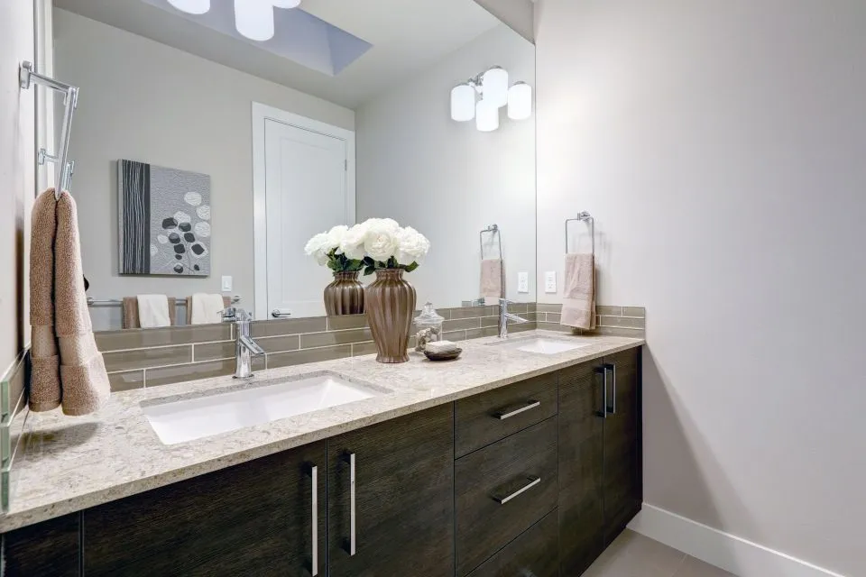
Matching butcher block with painted cabinet hardware
Butcher block brings warmth, visible grain and a practical, furniture-like character to a kitchen. Painted cabinetry and hardware determine how that warmth is framed, so the right combination can make a room feel considered rather than assembled from separate finishes. The goal is not to make every surface identical. It is to create a clear relationship between timber, paint, metal and the surrounding room.
Australian kitchens often need to balance style with everyday use. A compact Sydney apartment may require a visually light palette, while a Brisbane home must account for humidity and strong sunlight. In a Melbourne renovation, painted joinery may sit beside heritage details, whereas an Adelaide or Perth kitchen may open directly onto an outdoor entertaining area. These conditions influence which timber finish, cabinet colour and hardware will remain attractive over time.
Start with the timber’s undertone
Every butcher block has an underlying colour, even when it appears broadly neutral. Beech and maple tend to have a pale, creamy appearance. American or European walnut is deeper and more chocolate-toned, while oak can carry yellow, honey or grey-brown notes depending on the species and finish. Rubberwood, commonly used in some benchtops, usually has a light, fairly even grain that accepts stain well.
Look at the timber in daylight before choosing cabinet paint or handles. Warm timber usually pairs comfortably with colours containing yellow, beige, olive or muted red undertones. Cool whites, blue-greys and crisp blue can make warm timber look more orange by comparison. If the benchtop has a pale natural oil, a soft white or putty-coloured cabinet often creates a relaxed Scandinavian or coastal feel.
The finish changes the visual temperature as well. A clear matte oil preserves a natural appearance, while a darker stain makes the benchtop more visually dominant. A glossy coating reflects light and can make grain appear more dramatic. Sample boards are valuable because the same paint colour may look balanced beside raw timber but too cool beside an amber-toned finish.
Choose painted cabinet colours that support the grain
White cabinetry remains a dependable choice, but the particular white matters. Warm white, ivory and chalk tones blend naturally with golden timber, while a cooler white creates sharper contrast and a more contemporary edge. In a narrow kitchen, pale cabinets and a light butcher block can help the room feel open without becoming sterile.
Sage, eucalyptus and muted olive are especially effective with timber because they echo natural colours without competing with the grain. These shades suit Australian interiors that connect the kitchen with a garden, courtyard or verandah. Deep green can also work beautifully, although it benefits from sufficient daylight and hardware with a clear metallic presence.
Navy, charcoal and black cabinetry create a stronger architectural look. With these colours, select a butcher block with enough tonal depth to avoid appearing washed out. Walnut or smoked oak can hold its own against dark paint, while pale beech offers a deliberate light-dark contrast. Test the combination beside flooring, splashback samples and wall colour, since cabinet paint rarely appears in isolation.
Match hardware by temperature and finish
Hardware should relate to both the painted joinery and the butcher block. Brushed brass, aged brass and antique bronze bring out the warmth of oak, walnut and honey-coloured timber. They suit cream, taupe, olive and dark green cabinets particularly well. Aged finishes are forgiving because small changes in patina appear intentional rather than damaged.
Black handles provide definition and work with almost any cabinet colour. They are especially effective with white, pale grey, sage and natural timber. Choose a low-sheen or satin black when the kitchen has other matte elements; polished black can look disconnected beside an oiled timber surface. Slim bar pulls give a modern appearance, while cup pulls add a traditional or farmhouse note.
Brushed nickel, stainless steel and chrome are cooler choices. They pair well with pale butcher block, blue-grey cabinetry and kitchens with stainless appliances. Chrome is reflective and formal, whereas brushed nickel is softer and better suited to a relaxed family kitchen. In a Melbourne terrace with classic joinery, satin nickel can bridge traditional cabinet profiles and contemporary appliances without creating excessive contrast.
Coordinate handles with cabinet style and scale
Hardware shape should reinforce the door profile. Shaker-style painted doors can accommodate bar pulls, knobs, cup pulls or a combination of these. Flat-panel doors generally suit simple linear pulls, while routed or raised-panel cabinetry can support more decorative hardware. The timber benchtop already contributes visual detail, so highly ornate handles may make the composition feel busy.
Scale matters just as much as colour. Very small knobs can disappear against a wide drawer, while oversized pulls may dominate a compact kitchen. Align pulls consistently across doors and drawers, and consider the direction of the grain when deciding whether a horizontal or vertical handle feels more natural. Long drawer pulls can echo the length of a butcher block island and make the whole run appear more deliberate.
For Australian homes, practical spacing is worth considering. Handles need to be comfortable when hands are wet or occupied, particularly around sinks and prep areas. A sturdy pull is generally easier to use than a tiny decorative knob. It should also leave enough clearance from adjacent walls, appliances and corner cabinetry so doors can open fully.
Build a deliberate palette instead of matching everything
A successful kitchen usually has a dominant finish, a supporting finish and a small accent. If the butcher block is the dominant feature, painted cabinets can remain quiet and hardware can provide a controlled accent. If the cabinets are a bold colour, the timber may work better in a simple clear finish with understated pulls.
Repeat one material elsewhere to make the hardware feel connected. Brass handles might relate to a tap, pendant light or shelf bracket. Black hardware can echo window frames, sink fixtures or a dark cooktop. There is no need to repeat the same metal in every object, but the finishes should have a visual reason for appearing together.
Mixing metals is possible when the hierarchy is clear. For example, brushed brass cabinet pulls can sit with a stainless-steel appliance if the appliance remains a functional background element. Avoid introducing several competing polished finishes near the island. In an open-plan Brisbane kitchen, where the benchtop is visible from the living area, a limited palette will look calmer from every angle.
Account for maintenance, moisture and Australian conditions
Butcher block needs a finish suited to its use. A food-safe penetrating oil preserves a tactile natural feel but requires periodic reapplication, especially near a sink or dishwasher. Hardwax oils offer a more resistant surface while retaining a low-sheen appearance. Film-forming finishes can provide stronger protection, though repairs may be more noticeable if the surface is heavily marked.
Water management is essential in humid areas such as Brisbane and coastal New South Wales. Wipe spills promptly, protect the area around the sink and make sure the dishwasher is correctly sealed beneath the benchtop. Good ventilation also helps timber remain stable. Expansion and contraction are normal, so installation should allow the wood to move rather than trapping it tightly between fixed surfaces.
Painted cabinets need their own care routine. Satin or low-sheen enamel is generally practical because it can be wiped without showing every fingerprint. Dark colours may reveal dust, while very pale colours show marks around handles. Choose hardware with enough projection to keep oily hands away from the painted face, particularly on frequently used drawers.
If a renovation includes other flooring or moisture-control work, consider the wider environment rather than treating the benchtop as an isolated item. Information about moisture barrier guidance illustrates why vapour and damp conditions deserve attention wherever building materials meet a potentially wet substrate.
Plan the installation around the whole kitchen
The best colour pairing can still fail if the proportions and installation details are overlooked. Confirm the cabinet layout, appliance clearances, sink position and splashback height before finalising the benchtop. Timber grain direction should be discussed during templating, especially where sections meet at corners or form a waterfall edge.
A professional template is useful before old surfaces are removed because walls are rarely perfectly straight and existing cabinets may not be square. A careful template before demolition can identify unusual angles, service penetrations and overhang requirements while the existing kitchen is still available for reference.
Islands require particular attention. A generous overhang is attractive for stools, but the cabinet structure and support system must carry the load safely. The relevant overhang weight limits should be checked before designing seating, especially when the timber extends beyond the island base.
Australia’s countertop market also deserves careful consideration when selecting neighbouring surfaces. Since engineered stone restrictions took effect nationally from 1 July 2024, homeowners should verify what a supplier means by “quartz” and ask about the material’s composition, fabrication requirements and compliance. Porcelain, natural stone, timber and other surfaces may offer different practical and regulatory options. A butcher block can therefore serve as a distinctive focal point while reducing reliance on a single material throughout the room.
Use samples to make the final decision
View cabinet paint, timber finish and hardware together rather than choosing each from separate catalogues. Place samples near the splashback, flooring and appliance finish, then inspect them in morning, afternoon and artificial light. Warm LED lighting can make brass and timber appear richer, while cool lighting may exaggerate blue or grey cabinet undertones.
For a reliable combination, begin with the timber and decide whether its character is pale, warm, neutral or dark. Select a paint colour that either blends with that temperature or creates a deliberate contrast. Then choose hardware that repeats a nearby finish or introduces a measured accent. This sequence prevents the handle from becoming an afterthought.
A pale oak butcher block with warm white cabinets and aged brass creates a soft, welcoming kitchen. Walnut with muted sage and bronze feels grounded and sophisticated. Light timber with charcoal cabinetry and brushed nickel gives a crisp contemporary result. Each pairing works because the finishes have an intentional relationship, while the grain remains visible as a natural feature.
The strongest design is usually the one that respects how the kitchen will be used. Painted cabinetry supplies colour and structure, hardware provides touch and definition, and butcher block contributes warmth that becomes richer with appropriate care. When those roles are balanced during design, the finished space can feel both distinctly personal and durable enough for everyday Australian living.