Matching Countertops and Subway Tile for Australian Kitchens
A countertop and subway-tile splashback should feel like parts of the same kitchen rather than two unrelated finishes. The best pairings usually share a visual quality—warmth, softness, contrast or texture—while allowing one surface to take the lead. This approach works for compact apartment kitchens in Melbourne, open-plan homes in Brisbane and larger family kitchens in Adelaide or Perth.
Subway tile is especially versatile because its familiar rectangular shape can look classic, coastal, industrial or contemporary depending on colour, finish, grout and layout. The countertop then provides the larger visual field, so its pattern, edge profile and undertone need to support the tile instead of competing with it. Material choice also deserves careful attention in Australia, where engineered stone regulations have changed the market and porcelain, natural stone and solid-surface products are increasingly important alternatives.
Start With Colour Undertones
The easiest way to create a coordinated scheme is to compare undertones rather than simply matching obvious colours. A white subway tile may lean blue, grey, cream or pink, while a white countertop can have similar hidden warmth. Place physical samples together in daylight and under the kitchen’s warm or cool LED lighting. A combination that looks balanced in a showroom may appear stark beside Australian sunlight or shadowed cabinetry at home.
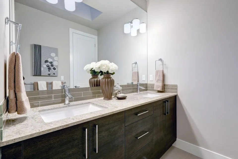
For a calm kitchen, pair warm white tile with a benchtop containing beige, taupe or soft-gold movement. Cool white tile generally suits pale grey quartz alternatives, concrete-look porcelain or granite with charcoal flecks. If the benchtop has strong veining, a plain tile in a related tone gives the stone visual priority. If the counter is quiet and uniform, handmade-look subway tiles can add depth through gentle variation in glaze and surface texture.
Exact colour matching is rarely necessary. Repeating one secondary colour from the benchtop in the tile or grout is usually enough to connect the surfaces. For example, a marble-look porcelain slab with fine grey veining can work with a soft grey subway tile, even when the tile is several shades darker. Timber cabinetry, brushed brass hardware or matte black tapware can then bridge the remaining differences.
Balance Pattern, Scale and Grout
Pattern density matters as much as colour. A heavily veined marble, granite or porcelain benchtop already contains movement, so a simple brick-laid tile with narrow, low-contrast grout will prevent the wall from becoming visually busy. Conversely, a plain white or charcoal countertop can support zellige-style variation, a herringbone arrangement or a coloured gloss tile.
The dimensions of the tile should relate to the scale of the kitchen. Standard subway formats around 75 by 150 millimetres suit traditional and transitional rooms, while longer rectangular tiles create a more streamlined appearance. In a narrow galley kitchen, vertical or stacked installation can draw the eye upwards. A horizontal running bond makes the room feel wider and reinforces the familiar subway-tile character.
Grout changes the apparent pattern. Matching grout softens the joints and makes the splashback read as a continuous surface; contrasting grout highlights every rectangle and gives the wall a stronger graphic quality. White grout with a white tile looks fresh but can require more maintenance near a cooktop or sink. A mid-grey grout often provides a practical compromise for busy Australian households, where regular cooking, coffee making and entertaining put the splashback through daily use.
The junction between the counter and tile should be planned before installation. A small silicone joint allows for movement and moisture protection, while a tiled edge, stone upstand or metal trim creates a deliberate finish. The selected sealant should be suitable for wet areas and compatible with both materials, especially where natural stone may react to staining or acidic products.
Choose Materials That Suit Australian Conditions
Australian homeowners have a wide range of surfaces available, but the legal position of engineered stone must be considered at the beginning of a renovation. Since 1 July 2024, Australia has prohibited the manufacture, import and installation of engineered stone benchtops, panels and slabs containing crystalline silica. State and territory requirements can also govern work involving existing products, so homeowners should use licensed professionals and check current local workplace-safety guidance before arranging alterations.
This change has increased interest in porcelain, sintered stone, granite, marble, soapstone, solid surfaces and timber butcher block. Porcelain pairs well with subway tile because both can offer a clean contemporary look, while granite introduces natural variation and a more substantial character. Marble can create a refined scheme but benefits from careful sealing and prompt cleaning. Butcher block brings warmth to glossy ceramic tile, although it needs a maintenance routine suited to water, heat and food preparation.
Outdoor exposure is another local consideration. In sunny areas such as Perth, Brisbane and parts of regional New South Wales, ultraviolet light and heat can affect some finishes, adhesives and sealants. An outdoor kitchen needs materials rated for exterior use, with attention to thermal movement and weather exposure. A colour scheme that works indoors may need a more fade-resistant porcelain or natural stone selection outside.
For bathrooms, the countertop, wall tile and shower surfaces must be assessed as one moisture-management system. The Countertop Store’s bathroom surfaces service information illustrates how counters, shower walls, integrated sinks and related details can be planned together rather than treated as isolated purchases. In any Australian bathroom, waterproofing, falls, ventilation and compliant installation are as important as the visual match.
Create Contrast Without Losing Cohesion
Contrast can make a kitchen feel purposeful, particularly when the cabinetry and flooring are restrained. A deep green, navy or charcoal subway tile can frame a pale countertop and create a strong focal wall. The reverse arrangement—a darker stone-look benchtop with light tile—feels grounded while keeping the work area visually bright.
Contrast should be repeated somewhere else in the room. A black grout line might relate to black window frames or handles; terracotta tile can connect with timber stools; muted sage can echo cabinetry or indoor plants. This repetition prevents the splashback from looking like an isolated colour decision. It also helps an open-plan kitchen sit comfortably beside Australian living and dining areas, where finishes are visible from several angles.
When using a patterned counter, consider whether the splashback should disappear slightly behind it. Large-format porcelain or a simple matte tile can provide a quiet background, especially in a kitchen with stone-look flooring and statement lighting. When the benchtop is plain, a glossy subway tile can reflect light and add dimension without requiring a complicated layout.
A feature strip can add interest, but it should be used selectively. A narrow band of handmade tile, a change from vertical to horizontal placement or a contrasting tile behind the rangehood can define the cooking zone. Keep the transition aligned with cabinetry or a benchtop edge so it appears intentional. Randomly ending a feature partway across a wall can make the overall installation look unfinished.
Plan Edges, Samples and Installation Details
Order full-size samples whenever possible. A small tile chip may conceal shade variation, while a tiny stone sample may not reveal the scale of veining across a two-metre island. View samples beside cabinet doors, flooring, tapware and paint at different times of day. Australian homes can receive intense northern light, low winter sun or strong reflected light from pale outdoor paving, all of which change how colours are perceived.
The benchtop edge profile also influences the style. A slim square edge suits stacked or elongated subway tile in a contemporary kitchen. A softened edge can complement handmade tile and natural stone in a more relaxed scheme. Waterfall ends, curved counters and furniture-style islands require careful tile termination so the splashback supports the shape without awkward cut lines.
Large-format porcelain can be a useful alternative when the goal is minimal grout and a calm wall behind a busy countertop. It can also continue from the benchtop into a splashback or shower application, creating visual continuity. A large-format porcelain guide explains the design thinking behind slab-based wall surfaces, including how fewer joints can affect the overall appearance.
Before fabrication, confirm the position of power points, rangehoods, windows, shelves and wall niches. The tile layout should be set out from the most visible point, not simply started at the nearest corner. A fabricator and tiler should coordinate the finished benchtop thickness, upstand height and splashback dimensions so the tile does not need an improvised cut around the counter.
Pairing Ideas For Different Styles
- Warm white subway tile with cream-veined porcelain and timber cabinetry
- Pale grey tile with charcoal granite and brushed stainless steel
- Glossy sage tile with a quiet white solid-surface benchtop
- Matte ivory tile with soapstone, black hardware and oak accents
A durable pairing is also easier to maintain when the cleaning requirements are compatible. Non-abrasive cleaners generally suit glazed ceramic tile and many porcelain surfaces, while natural stone may require pH-neutral products and periodic resealing. Ask for care instructions before selecting grout, especially if the kitchen includes a heavily used cooktop or a butler’s pantry.
Details To Confirm Before Installation
- Tile size, layout and grout colour
- Benchtop undertone, veining and edge profile
- Upstands, silicone joints and corner treatments
- Waterproofing, ventilation and material compliance
The most successful schemes establish a clear hierarchy. Decide whether the benchtop, tile, cabinetry or a feature such as the rangehood will attract the most attention, then keep the other elements supportive. This is particularly valuable in smaller Australian kitchens, where several strong patterns can make the room feel crowded.
A coordinated result does not require identical surfaces. It requires a shared relationship between colour, scale, texture and maintenance. With properly matched samples, a compliant material choice and close coordination between the fabricator and installer, subway tile can provide a practical backdrop that makes the countertop look considered for years to come.