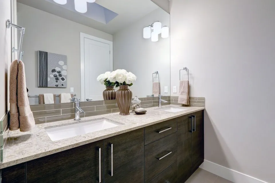
Matching Benchtops With Your Cabinet Style
Cabinetry sets the visual direction of a kitchen or bathroom, while the benchtop supplies the surface that ties the room together. The right pairing can make modest joinery look considered and expensive, whereas a mismatched combination may leave even high-quality materials feeling disconnected. Colour, texture, profile, light reflection and visual weight all affect how the finished space reads.
A useful starting point is to identify the character of the cabinets. Shaker doors, flat-panel joinery, timber fronts, glossy laminates and traditional raised-panel doors each create a different design language. Your countertop should support that language rather than compete with it. This applies to kitchen islands, bathroom vanities, laundry counters and custom furniture pieces.
Australian homes add practical considerations to the design process. A coastal property near Brisbane or Sydney may need surfaces that cope with humidity, salt air and strong sunlight, while a Melbourne renovation may prioritise warmth and natural texture. In Perth, Adelaide or regional areas, availability, transport and fabrication lead times can influence which slab is realistic for the project.
It is also worth treating the countertop as part of a complete surface scheme. The benchtop, splashback, wall colour, flooring, tapware and cabinet hardware should be reviewed together before fabrication begins. A professional fabricator can help with measurements, seam placement, edge details, sink cut-outs and the suitability of each material for the way your household uses the room.
Start With The Cabinet Profile
Traditional cabinetry usually benefits from a countertop with movement and depth. Shaker doors, inset cupboards and decorative panels pair comfortably with marble, granite, soapstone or a softly veined quartz-look surface. These materials echo the craftsmanship of the joinery without making the kitchen feel overly formal. Honed finishes can create a relaxed heritage appearance, while a polished surface adds brightness and a more refined edge.
For a classic white or cream kitchen, consider a benchtop with gentle grey veining, warm taupe movement or small mineral flecks. Strong, dramatic veining can work beautifully, but it needs to be repeated or balanced elsewhere in the room. If the cabinets already have ornate hardware, a complex door profile or a strong paint colour, a calmer surface will usually provide better visual control.
Flat-panel and handleless cabinets suit cleaner, more architectural materials. Large-format porcelain, Dekton, concrete-look surfaces and restrained quartz designs can reinforce a minimalist scheme. A crisp white benchtop with matte black or natural timber cabinets produces a distinctly contemporary result, while a charcoal surface against pale joinery creates stronger contrast.
The key is to avoid matching every element at exactly the same intensity. A dark cabinet, dark countertop and dark splashback can absorb light and make a compact kitchen seem enclosed. If you prefer a tonal look, vary the finish: pair matte joinery with a lightly reflective benchtop, or combine a textured timber veneer with a smooth stone surface.
Pair Natural Timber With A Considered Surface
Timber cabinets introduce warmth, grain and variation, so the countertop should be selected with the wood species and stain in mind. Pale oak, ash and Tasmanian oak often work with white, cream, soft grey or light concrete-look surfaces. Walnut, jarrah and darker stained timber can support richer stone colours, including deep green, charcoal, warm brown and black.
Natural stone can be especially effective with timber because the two materials have different but complementary patterns. Granite may bring granular movement and strength to a simple timber kitchen, while marble offers a lighter, more expressive appearance. Soapstone creates a soft, low-sheen finish that suits a relaxed farmhouse or provincial scheme. Samples are essential because timber undertones can shift noticeably under warm and cool lighting.
Butcher block is another option where the goal is continuity between cabinetry and work surfaces. It can create a welcoming look on an island or breakfast bar, particularly in a Hamptons, country or Scandinavian-inspired kitchen. However, timber requires regular care and should be kept away from areas that receive constant standing water. It may be best used selectively rather than across every counter.
In an Australian renovation, timber also needs to be assessed against local conditions. A beachside home can expose materials to moisture and salt-laden air, while intense summer sun through north-facing glazing may alter some finishes over time. Ask about sealing, UV stability, cleaning products and ventilation before committing to a particular combination.
Use Colour And Contrast With Intention
The simplest way to coordinate cabinets and countertops is to decide whether the room will be high contrast, low contrast or tonal. High-contrast schemes might use white cabinets with a black granite surface, navy joinery with pale marble-look porcelain, or light timber with a deep green stone. These pairings are visually confident and can make an island a strong focal point.
Low-contrast schemes use closely related colours but rely on texture and finish to prevent blandness. Warm white cabinets with an ivory countertop, or greige joinery with a taupe surface, can make a room feel larger and calmer. This approach is useful in smaller apartments and narrow galley kitchens, including the compact layouts common in inner-city Melbourne and terrace homes in Sydney.
Tonal design does not mean every sample should be identical. Look for differences in veining, sheen, grain direction and edge treatment. A satin cabinet finish can sit comfortably beside a polished stone, while a rougher timber surface may need a honed or leathered countertop to maintain balance. Always view samples in daylight and under the room’s planned artificial lighting.
If your cabinets have a strong colour, use the benchtop to stabilise the scheme. Deep blue, forest green and terracotta joinery can look striking with a quiet off-white or natural stone surface. A patterned countertop can work too, but repeat one of its secondary colours in the splashback, pendant lights, stools or accessories so it feels deliberately connected rather than random.
Choose The Right Material For The Look
Quartz-style surfaces are popular because they offer consistent colour, predictable patterning and straightforward cleaning. They suit contemporary, transitional and many classic cabinet styles. A subtle quartz design can calm heavily detailed joinery, while a veined option can give plain slab doors a focal point. In Australia, however, buyers must understand current engineered-stone regulations and confirm that the selected product can legally be supplied and installed.
Since 1 July 2024, engineered stone benchtops have been banned across Australia because of silica-related health risks. The rules affect supply, manufacture and installation, although details concerning existing surfaces and permitted alternatives can vary by jurisdiction. A reputable business should explain what is compliant and offer suitable options, such as porcelain, natural stone, solid surface or other approved materials.
Granite is a strong choice for busy kitchens, especially when cabinets are simple and the countertop is expected to provide character. Marble has a luxurious appearance and works well with traditional cabinetry, but it can etch or stain if not properly maintained. Porcelain and Dekton are useful for sleek modern designs and can provide large-format continuity across benchtops, splashbacks and wall surfaces.
For a softer, more tactile look, soapstone and honed natural stone can complement painted timber or classic joinery. Integrated sinks and matching wall panels can reduce visual breaks in a bathroom or laundry. The important issue is to match the material’s maintenance needs with the household’s habits, not just its colour with the cabinet door.
Coordinate Edges, Splashbacks And Hardware
The edge profile can change how the countertop relates to the cabinets. A square edge feels modern and visually light, while a small bevel adds a subtle highlight without becoming decorative. Ogee and other detailed profiles generally suit traditional doors, raised panels and formal interiors. On a thick island top, a laminated edge can create a substantial furniture-like appearance.
Splashbacks should support the connection between the cabinet fronts and the benchtop. A plain tile, slab splashback or painted wall may be ideal when the countertop has dramatic movement. If the surface is quiet, patterned tile or textured ceramic can add interest. Before choosing, review advice on matching backsplash materials, particularly when a veined surface will continue up the wall.
Hardware provides another opportunity to bring the scheme together. Brushed brass can warm white, cream and timber cabinets, while chrome or stainless steel suits cooler contemporary palettes. Black handles can sharpen pale cabinetry and echo a dark vein in the benchtop. Avoid selecting hardware in isolation: taps, appliances, pendant lights and cabinet pulls should share a compatible undertone and level of visual weight.
A fabricator can also advise on seams, overhangs, waterfall ends and sink installation. A waterfall edge may make a stone island feel like a solid architectural block, whereas a standard overhang preserves more floor space. In an outdoor kitchen, the countertop must be selected for weather exposure, heat and cleaning demands rather than indoor appearance alone.
Test Samples Before Making A Final Choice
Digital images are useful for narrowing down options, but they cannot show the full variation within a slab. Veining, aggregate size and colour can look different at the supplier’s showroom, in a fabrication workshop and inside your home. View full-size samples where possible, then place them beside the cabinet door, flooring, splashback sample and paint colour.
Pay attention to the direction of grain and pattern. A long island may look best with veins running along its length, while a small vanity can benefit from a centred feature. Bookmatching or vein matching can create a dramatic effect on a splashback, though it may increase material use and fabrication costs. The layout should be discussed before the slab is cut.
Ask for a detailed quotation that covers templating, cut-outs, edging, delivery, installation, plumbing disconnection and disposal. Australian renovation pricing can vary according to state, access and slab availability, and a difficult stairway or tight apartment lift may affect installation costs. A proper site measure helps identify walls that are out of square and reveals whether cabinets need adjustment.
Finally, judge the pairing at full scale. A cabinet sample beside a small stone chip may seem perfect, yet the same colours can behave differently across several metres of benchtop. Take your time with the decision, account for natural and artificial light, and prioritise a combination that will remain practical and visually comfortable as the room is used every day.