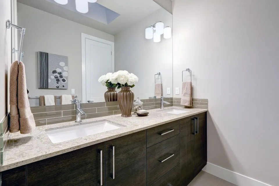
How to match your countertops with your cabinet colors
Countertops and cabinets occupy most of the visual space in a kitchen, so their relationship shapes the room’s entire character. The right pairing can make a compact kitchen feel open, give a large room a sense of warmth, or create a refined contrast that makes both surfaces stand out. A successful design does not require every finish to match perfectly. It requires the colors, undertones, patterns, and textures to work together.
Cabinet color is often chosen first, but the countertop has an important role in balancing that decision. A white quartz surface can brighten dark cabinetry, while a richly veined granite may give simple painted cabinets a stronger focal point. Wood cabinets introduce additional grain and warmth, which means the countertop should complement those qualities rather than compete with them.
The most reliable approach is to compare physical samples in the actual room. Lighting, flooring, wall paint, hardware, and backsplash materials can change how a cabinet door or stone slab appears. Looking at small samples beside one another helps reveal undertones that may not be obvious in a showroom.
Start with cabinet undertones
The basic cabinet color is only part of what you see. White cabinetry may lean warm, cool, gray, or creamy. Green and blue paint can have gray undertones, while beige cabinets may carry yellow, pink, or taupe influences. Natural wood varies even more, ranging from honey oak and reddish cherry to pale maple, walnut, and deep espresso.
Identify the undertone before choosing a countertop. Warm cabinets generally pair well with cream, beige, tan, warm gray, and gold-flecked surfaces. Cool white, blue, and gray cabinetry often looks cleaner with bright white, cool gray, charcoal, or stone with subtle blue or silver movement. This does not mean warm and cool finishes can never be combined, but the contrast should feel intentional.
A countertop with several colors can bridge different finishes. For example, a quartz surface with soft white, gray, and beige veining may connect greige cabinets with warm wood flooring. A granite slab containing cream, brown, and charcoal can coordinate painted cabinetry with bronze hardware and a darker backsplash. The goal is to find at least one shared color while allowing another element to provide contrast.
Choose between contrast and coordination
A coordinated kitchen uses related colors and similar visual temperatures. Light beige cabinets with a creamy quartz countertop create a calm, continuous appearance, especially when paired with a simple backsplash. This approach works well in traditional, transitional, and farmhouse interiors because it emphasizes comfort and material texture rather than sharp color changes.
Contrast creates a more defined design. Navy, forest green, black, or espresso cabinets can look striking with a pale countertop, while white cabinetry gains depth from a dark soapstone or charcoal granite surface. Contrast is especially effective on an island, where the countertop can become a central feature without making every wall cabinet feel dramatic.
When using contrast, consider how much pattern the room can handle. A bold cabinet color and highly active granite may compete for attention. In that situation, a quieter quartz or porcelain surface can provide balance. If the cabinetry is simple and neutral, a marble-look slab with expressive veining may supply the visual interest the room needs.
For homeowners considering a darker natural surface, reviewing the soapstone island guide can help clarify how the material’s deep color, soft texture, and maintenance characteristics fit an island design.
Compare countertop materials with cabinet styles
Material selection affects color matching because each surface displays color differently. Quartz offers consistent backgrounds and predictable veining, making it useful when a precise cabinet pairing matters. It is available in bright whites, warm neutrals, concrete-inspired grays, and darker tones, with patterns ranging from understated to strongly marbled.
Granite provides natural movement, mineral variation, and a broad range of base colors. Since each slab is unique, a small sample may not show the full pattern. Viewing the actual slab is particularly important when matching granite with colorful or highly grained cabinets. A fabricator can help identify the dominant background color and the accent tones that should be repeated elsewhere in the room.
Marble and porcelain can deliver dramatic veining or a clean architectural look. Marble often brings soft gray, taupe, or gold movement that complements both painted and wood cabinetry. Porcelain can imitate marble, concrete, or other materials while supporting a modern design. Dekton offers a sleek, durable option for contemporary kitchens, while butcher block introduces natural warmth that works well with painted cabinets and relaxed interiors.
| Cabinet color or finish | Countertop direction | Backsplash and hardware approach |
|---|---|---|
| Bright white | White, soft gray, charcoal, or patterned stone | Add texture, metallic warmth, or a controlled accent color |
| Cream or beige | Warm white, taupe, tan, or gentle veining | Use brass, bronze, natural stone, or creamy tile |
| Gray | White, charcoal, blue-gray, or warm stone for contrast | Balance cool tones with wood, brass, or warm lighting |
| Navy or deep green | Light quartz, marble-look porcelain, or pale granite | Keep the backsplash calm and repeat the cabinet color sparingly |
| Natural oak or maple | Cream, warm gray, white, or subtle earthy stone | Coordinate with wood tones without matching every grain |
| Walnut or espresso | Light neutral, green-gray, or softly patterned countertop | Use lighter walls or backsplash materials to maintain openness |
Let light and room size guide the palette
Natural and artificial light can change the appearance of both cabinetry and countertops. A north-facing kitchen may make cool gray surfaces look blue and can cause white cabinets to appear dull. Warm bulbs can make cream surfaces look more yellow and enhance the reddish tones in wood. View samples during morning, afternoon, and evening conditions whenever possible.
In a small kitchen, a light countertop that blends gently with the cabinets can reduce visual breaks and make the room feel larger. A matching or closely related backsplash can extend that effect. This does not mean a small kitchen must be entirely white; a muted green cabinet or pale wood finish can work beautifully when paired with a light, low-contrast surface.
Large kitchens can support stronger differences in color, pattern, and texture. A dark island beneath pendant lighting can anchor an open floor plan, especially when the perimeter cabinetry and countertops remain lighter. Waterfall edges, a contrasting prep surface, or a furniture-style section can define zones without requiring completely different materials throughout the space.
Remember to evaluate flooring and wall color at the same time. A countertop that looks neutral against a white wall may appear yellow beside cool gray flooring. Since the eye reads all nearby surfaces together, the final palette should include a connection between the cabinetry, countertop, backsplash, and surrounding finishes.
Use the island to add personality
The island does not have to use the exact same countertop as the perimeter cabinets. A different surface can create a focal point, provide a stronger work area, or visually separate food preparation from seating. For example, white perimeter quartz with a walnut island top can add warmth, while dark green island cabinetry with a pale marble-look surface can create a dramatic centerpiece.
If the island and cabinets are already visually strong, a quieter countertop usually produces the best result. A nearly solid quartz surface can keep a colorful island from feeling busy. Conversely, simple white or light-gray cabinets may benefit from a distinctive island slab with veining, mineral variation, or a contrasting edge.
Scale matters when selecting a patterned slab. Large veining may disappear on a narrow counter but become highly expressive across a broad island. Ask how the pattern will appear at seams, around a sink cutout, and along a waterfall side. Professional templating and fabrication help position the most attractive portions of the slab where they will be most visible.
An integrated sink, custom edge profile, or matching backsplash can make the countertop feel deliberately designed rather than selected as an isolated product. These details are especially useful when several materials share the room. Repeating a countertop color in a shower wall, fireplace surround, or nearby furniture piece can also create continuity in an open-plan home.
Coordinate details without overmatching
The backsplash should support the cabinet-countertop relationship rather than introduce an unrelated third focal point. If the countertop has bold movement, a simple backsplash in a compatible tone is usually easier to live with. If the countertop is quiet, handmade tile, textured porcelain, or a patterned backsplash can add dimension.
Hardware offers a practical way to connect contrasting colors. Brass can warm white, green, navy, and gray cabinetry. Matte black can sharpen a pale countertop and reinforce dark accents. Bronze works naturally with wood, cream, tan, and earthy stone. Hardware does not need to match every fixture exactly, but repeating the finish in lighting or plumbing helps the design feel intentional.
Edge profiles and cabinet door styles also affect the overall impression. A restrained eased edge suits modern cabinetry and minimalist quartz. A more decorative edge may complement traditional doors and natural stone. Shaker, slab, raised-panel, and inset cabinets each create a different amount of visual detail, so the countertop pattern should be selected with that level of ornamentation in mind.
Avoid choosing a countertop solely from a digital image. Screen color, photography, and lighting can hide variation in stone and porcelain. At a local showroom or fabrication shop, you can place cabinet samples beside full-size material selections, discuss seam placement, and review edging options before fabrication begins.
Practical ways to make the choice easier
A clear process keeps color decisions manageable and reduces the chance of expensive mismatches. Bring cabinet doors, flooring samples, backsplash ideas, and paint colors to the consultation. If an existing cabinet finish will remain, photograph it in multiple lighting conditions and bring a small removable piece whenever possible.
Use these recommendations when narrowing your selections:
- Choose the cabinet undertone before focusing on the countertop’s pattern.
- Compare full-size slabs whenever granite, marble, or strongly veined porcelain is under consideration.
- Repeat at least one countertop color in the backsplash, flooring, hardware, or wall finish.
- Keep either the cabinets or the countertop visually quiet when the other element has strong color or movement.
- View samples in the kitchen’s natural and artificial light before approving fabrication.
A professional measurement and templating process can reveal design issues early. The position of seams, outlets, cooktops, sinks, and cabinet breaks may influence which part of a slab is most suitable. Fabricators can also explain how a selected material will perform around water, heat, seating overhangs, and daily cleaning.
For kitchens in North Little Rock and surrounding Arkansas communities, The Countertop Store can help coordinate cabinetry, countertop material, backsplash surfaces, edging, and installation details as one connected design. Its selection includes quartz, granite, marble, porcelain, Dekton, soapstone, and butcher block, allowing homeowners to compare both appearance and performance before committing.
Bring your cabinet samples and room measurements to The Countertop Store for a personalized consultation. With careful color comparison, accurate templating, and expert fabrication, your new countertop can complement the cabinetry while giving the kitchen a polished, lasting finish.