How to Choose a Countertop Colour That Hides Scratches
Every busy kitchen collects small signs of use. Keys, cookware, dropped cutlery and grit carried in from the garden can leave scratches, scuffs and nicks on a worktop. A well-chosen colour makes light damage harder to see, but colour is only one layer of protection. Material hardness, surface finish, lighting and maintenance determine whether wear looks dramatic or almost invisible.
Australian kitchens add a few distinctive pressures. Compact Sydney and Melbourne apartments leave less spare worktop, while family homes in Brisbane, Perth, Adelaide and regional centres often connect the kitchen to an alfresco area. Barbecue grease, sandy soil and sunscreen can reach the bench, and strong sunlight can make surface defects stand out. A north-facing kitchen may look completely different at breakfast than it does beside warm evening lights.
For anyone asking how to select a countertop colour that hides scratches in a busy kitchen, the most reliable approach separates appearance from durability. First choose a material that suits the cooking and cleaning routine. Next assess sheen and texture. Finally, compare the shortlisted colours in the room at different times of day. This sequence avoids paying for a fashionable slab that reveals every mark and produces a practical finish without making the kitchen feel institutional.
What Scratches Reveal About Colour
A fine scratch changes how light reflects from the surface. Fine abrasion often appears as a dull or pale line against a polished background; deeper damage creates a visible texture that catches overhead and under-cabinet lighting. Against a pale, uniform slab, a dark groove is obvious. Against a dark slab, a light scratch may stand out just as clearly.
The eye also responds to pattern. Fine flecks, soft veining or mottling in a mid-tone material give tiny marks somewhere to blend, provided the contrast is low. Strongly contrasting veins do the opposite: they make the eye an edge that reveals every nick. Texture can work in the same way, although deep grooves may hold soil.
Regular cleaning also affects colour perception. Dust and pale mineral residue are glaring on charcoal, whereas grease and dark kitchen debris show on cream. The same need for a hard-wearing, cleanable surface appears in industrial design, where durable epoxy flooring is used in metal fabrication workshops to withstand grit, spills and heavy traffic.
Comparing Light, Mid and Dark Shades
Pale shades such as cream, soft white and light grey suit Australian cabinetry and make small rooms feel brighter. They are less forgiving of dark scratches, knife lines, crumbs and embedded grit. A pale surface works best when the pattern has enough movement to disguise small marks and the household avoids working directly over the slab.
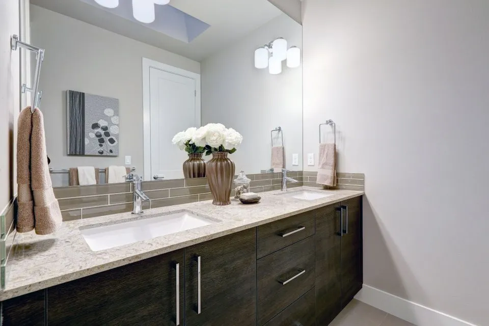
For most busy kitchens, a medium warm grey, greige or taupe is the most versatile compromise. These shades sit between the extremes: they are less likely to show pale scratches than charcoal and less likely to reveal dark tool marks than cream. Slight tonal variation gives the eye a little tolerance before a blemish becomes obvious.
Deep charcoal, black and navy surfaces create a dramatic focal point, but pale scratches, soap residue, water spots and fingerprints can make a uniform slab look busy. A dark material with visible movement may disguise wear better than a flat colour. Choose the darkest shade only when regular wiping and its reflective character suit the way you actually cook.
Why Finish and Texture Change the Result
Polished quartz, granite and porcelain reflect crisp highlights, making hairline scratches, fingerprints and cleaning swirls more noticeable. A honed, satin or matte finish diffuses light and generally disguises shallow abrasion. It is not damage-proof, however, and some natural stones need periodic honing if the surface dulls. A large finish sample is more informative than a tiny polished chip.
Textured finishes such as leathered or embossed surfaces create tiny visual interruptions that can soften the appearance of minor scratches. The trade-off is cleaning: raised texture can collect grit in its recesses, particularly in coastal or high-dust areas. Edge profiles also affect wear because corners and the underside of a mitred 40 mm edge can take the impact of a dropped pan.
Match the finish to the room’s lighting. Warm timber cabinets suit honey and taupe tones, while crisp white cabinetry can balance grey or charcoal stone. Under-cabinet LEDs reveal texture more strongly than daylight, so check the sample beneath the actual fittings. The best result is coordinated rather than perfectly matched: contrast can make the worktop feel deliberate without making every mark visible.
Choosing a Material for Heavy Daily Use
Quartz is one of the most common choices in the Australian renovation market because it offers consistent colour and relatively low maintenance. It resists ordinary abrasion better than many natural stones, yet fine particles dragged across the surface can still scratch it. Granite is also hard and hard-wearing, but knife cuts, impacts and acidic spills need care. Chopping boards prevent avoidable marks in both materials.
Porcelain and Dekton are particularly practical for heavy heat, staining and general wear. Their dense surfaces make casual abrasion less obvious, although exposed edges and corners can chip if struck hard. Porcelain can also feel cool against warm timber and cabinetry, so evaluate the complete palette. Confirm the manufacturer’s guidance before using any surface outdoors, particularly quartz that was not sold for exterior applications.
Marble, soapstone and butcher block each bring character but require different expectations. Marble can develop a patina that softens some wear, although acids may etch it. Soapstone is comparatively soft and can dull around busy cooking areas. Timber is easily marked by knives but can often be sanded and refinished. A busy household benefits from choosing one of these materials only when its maintenance and gradual ageing are genuinely acceptable.
Australian Homes, Climate and Renovation Reality
Australian kitchen planning often reflects an indoor-outdoor lifestyle. Compact metropolitan kitchens need every worktop area to function as a preparation, serving and storage zone, while suburban kitchens must handle large family meals, outdoor entertaining and constant movement between the bench, sink and barbecue. A colour that looks calm in a showroom may appear stark beside everyday clutter and strong natural light.
Climate affects both appearance and long-term performance. North-facing rooms in Brisbane and Perth can receive intense ultraviolet light, while Melbourne and Sydney experience greater seasonal temperature variation. Repeated heating can fade some pigments and resin components, and heat can affect adhesives or expansion at the edges. A manufacturer’s indoor-use warranty should not be assumed to cover prolonged exterior exposure.
Many renovations update kitchens in Australian homes built during the 1990s and 2000s, where original laminate, timber or basic stone surfaces are being replaced with quartz, porcelain or natural stone. Local stock varies by city, so a particular slab may not be available in another area. Natural stone and solid timber remain popular, but quartz and porcelain are strongly established because buyers often prioritise low maintenance and colour consistency.
Countertop colour is not itself regulated, but work adjoining showers and other wet areas must meet the National Construction Code and waterproofing requirements referenced in AS 3740. The Australian Consumer Law also protects consumers against defective or misdescribed goods and supports valid express warranties. A scratch-resistant description does not mean scratch-proof, so retain the product-specific care instructions and warranty rather than assuming all brands perform identically.
Sample Tests for Australian Kitchen Conditions
Bring cabinet-door samples, flooring references and the existing splashback when comparing worktop options. An A4 sample or suitable offcut can reveal undertones that a tiny display chip hides. Use the following checks before committing:
- View the colour in daylight, under the kitchen’s actual LEDs and beside white cabinetry.
- Ask for a controlled wear test on an offcut using grit similar to local construction dust.
- Handle the sample with cooking grease and wipe it with the cleaner you intend to use.
- Check how the colour looks beside timber, black metal and warm evening lighting.
Lighting changes throughout the day, particularly in a north-facing Australian kitchen. Morning light can expose surface texture, while evening LEDs emphasise reflections and fingerprints. Colour that appears balanced at noon may look cool, flat or excessively warm after dark, so judge the sample in more than one setting.
The second comparison should connect appearance with practical purchasing details:
- Coordinate the worktop with cabinetry and flooring without making every element identical.
- Confirm the slab, batch, pattern and finish before approving a particular piece.
- Review cleaning, repair and warranty terms for the exact material and finish.
- Record the edge profile, thickness, cut-outs and expected lead time in millimetres.
A final daylight check often exposes differences that showroom lighting softens. Take photographs beside the windows at different hours and compare them with the flooring and cabinet finishes. This simple record helps avoid a colour that appears attractive in isolation but clashes with the finished kitchen.
Ordering, Templating and Installation
After colour approval, selection should move into controlled countertop fabrication. In Australia, confirm that cabinetry and appliances are final before measurement, record dimensions in millimetres and allow for wall straightness, plumbing and appliance clearances. A template captures details that a straight tape cannot. Edging, cut-outs, joins and finish are then confirmed before fabrication and installation, reducing avoidable variations.
That end-to-end sequence is reflected in custom kitchen countertops from The Countertop Store, which serves North Little Rock, Arkansas, and nearby communities. Its consultation, measurement, templating, fabrication, edging and installation stages give buyers clear points for confirming colour, joins and edge details before the slab is cut.
The strongest choice for a high-traffic kitchen is usually a medium-tone warm grey, greige or taupe with a matte or honed finish and gentle tonal variation. It should be paired with a material suited to the household’s cooking habits, lighting and cleaning routine, then approved from a properly lit sample rather than a small showroom chip. This combination provides the most convincing balance between a well-finished appearance and long-term resilience.