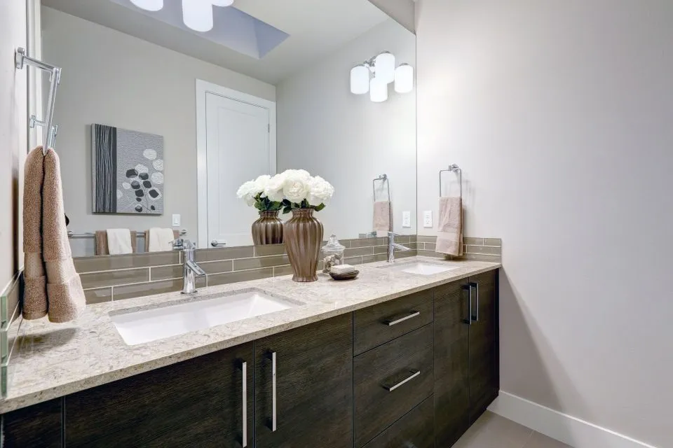
Choosing Grout for a White Quartz Backsplash
A white quartz countertop creates a bright, polished foundation for a kitchen or bathroom. Its clean surface can make a room feel larger, reflect natural light, and coordinate with nearly any cabinet color or backsplash tile. Grout, however, has a powerful influence on how that tile installation looks once the project is complete.
The best grout color depends on the tile’s shade, shape, layout, and the amount of contrast you want. A nearly matching grout produces a quiet, continuous appearance, while a darker joint emphasizes every tile and creates a more graphic pattern. The right selection should also suit your cleaning preferences, lighting, cabinetry, and overall design style.
White quartz works with far more than plain white grout. Soft gray, warm beige, taupe, charcoal, and even carefully chosen colors can enhance the backsplash without competing with the countertop. Understanding how each option behaves will make the design decision easier before installation begins.
Match Grout for a Seamless Appearance
White or near-white grout is the simplest choice when the goal is a smooth, unified backsplash. Matching the grout to a white subway tile minimizes the appearance of individual joints, allowing the wall surface to blend gently with the quartz countertop. This approach is especially effective in small kitchens, narrow galley layouts, and bathrooms where visual simplicity can make the space feel more open.
A matching grout color also places attention on other features, such as veined quartz, statement lighting, wood cabinetry, or decorative hardware. If the quartz includes gray or beige veining, pure white grout may look slightly stark beside it. In that case, a soft off-white can connect the tile and countertop more naturally.
The main drawback is maintenance. Light grout can show cooking splashes, dust, and discoloration more quickly than a medium-tone joint. A quality grout sealer can help protect cement-based grout, although sealing does not eliminate the need for routine cleaning. For areas behind a range or prep sink, stain resistance should be considered alongside color.
Use Soft Gray to Define the Tile
Light gray grout is one of the most versatile choices for a white quartz countertop. It offers enough contrast to outline each tile without creating a harsh checkerboard effect. On a white subway backsplash, pale gray joints can clarify the running-bond pattern while keeping the overall room calm and contemporary.
Gray grout is particularly useful when the quartz has cool veining, stainless steel appliances, gray cabinets, or polished nickel fixtures. It visually links those elements and can make a white tile appear less stark. A warm gray, sometimes called greige, works better with creamy quartz, natural wood, brass hardware, or warmer paint colors.
The exact shade matters. A sample that looks delicate in a showroom may appear much darker across a large backsplash. View grout samples beside the actual quartz slab, tile, cabinet door, and wall color. Lighting from windows and under-cabinet fixtures can shift gray toward blue, beige, or nearly white.
Consider Beige and Greige for Warmth
Beige grout can soften a white backsplash and prevent a kitchen from feeling overly clinical. It pairs well with ivory tile, cream-toned quartz, maple or oak cabinets, bronze fixtures, and earthy flooring. When the countertop contains warm tan, gold, or brown movement, a beige joint can pull the palette together.
Greige offers a balanced alternative when the room includes both warm and cool finishes. This blend of gray and beige gives white tile definition without committing the design to a distinctly blue-gray or yellow-beige direction. It is a strong option for transitional kitchens where traditional cabinetry meets modern quartz surfaces.
Warm grout colors are often forgiving in busy areas because minor debris and cooking residue may be less visible than on bright white joints. Still, the grout should complement the tile rather than imitate every color in the countertop. A restrained neutral usually ages better than a shade selected to match a small, isolated fleck of stone.
Create Contrast With Darker Grout
Charcoal, medium gray, or black grout produces a bold backsplash with clear geometric definition. The contrast highlights tile size, shape, and layout, making it a suitable choice for elongated subway tile, herringbone patterns, hexagons, scallops, and other decorative formats. With a white quartz counter, dark grout can create a crisp black-and-white palette.
This dramatic effect requires careful installation. Uneven joints, chipped tile edges, and slight layout inconsistencies become easier to see when the grout is dark. The tile setter must maintain consistent spacing and clean the surface thoroughly so cement haze does not dull the finished installation.
Dark grout can also make a backsplash feel visually busier. It may work beautifully with black cabinet hardware, dark lower cabinets, or a modern kitchen, but it can overpower delicate handmade tile or heavily veined quartz. Testing a larger mock-up is preferable to judging a small sample alone.
| Grout color | Visual effect | Works well with | Points to consider |
|---|---|---|---|
| Bright white | Seamless and airy | White tile, small spaces, minimalist rooms | Shows stains and can look stark |
| Soft gray | Defined but restrained | Cool quartz veining, stainless steel, modern cabinets | May look blue under certain lighting |
| Greige | Balanced and adaptable | Mixed warm and cool finishes | Needs comparison with the exact tile |
| Beige or ivory | Warm and welcoming | Cream tile, wood cabinetry, brass, warm quartz | Can clash with icy white materials |
| Charcoal | High contrast and graphic | Geometric tile, black accents, contemporary rooms | Emphasizes layout flaws and visual busyness |
| Colored grout | Expressive and customized | Accent walls, playful designs, specialty tile | May limit future decorating changes |
Coordinate With Tile Shape and Layout
Grout color changes how the backsplash pattern is perceived. A matching joint can make rectangular tiles read as a broad surface, while contrasting grout makes the staggered arrangement more prominent. In a herringbone design, strong contrast traces the zigzag and becomes a major decorative element.
For intricate mosaic tile, a grout color close to the dominant tile shade often prevents the wall from looking fragmented. If the mosaic contains several colors, select a neutral grout that supports the overall palette rather than matching one small accent. A medium gray or warm putty can provide visual structure without competing with the pattern.
Tile edge color also matters. Some ceramic and porcelain tiles have a colored body or a darker edge that becomes visible at the joints. A grout sample placed between actual tile pieces reveals the finished relationship more accurately than a color card. The Countertop Store can help coordinate surfaces during consultation, templating, and installation through our team, especially when the backsplash meets a custom quartz countertop or integrated feature.
The countertop-to-backsplash transition deserves attention as well. A small bead of caulk, rather than rigid grout, is generally used where the two surfaces meet because those materials can move independently. The caulk should closely coordinate with the grout so the joint looks intentional and remains easier to maintain.
Choose Materials for Maintenance and Durability
Color is only one part of grout performance. Traditional cement grout is widely available and economical, but it typically benefits from sealing and can absorb moisture or staining. This matters behind a cooktop, coffee station, or sink where oils, sauces, and water are common.
Premixed grouts can offer convenient application and consistent color, while high-performance or epoxy grout provides stronger resistance to stains and moisture. Epoxy products may be more demanding to install and can cost more, but they are worth discussing for heavily used backsplashes or shower-adjacent applications. Product suitability depends on the tile, joint width, exposure, and installer’s experience.
Avoid choosing grout solely because it appears clean in a showroom. Very white grout may require frequent attention, while very dark grout can show mineral deposits, soap residue, or light-colored dust. A mid-tone neutral often provides a practical balance for families who want an attractive surface without constant spot cleaning.
Use the manufacturer’s care instructions after installation. Harsh acids, abrasive powders, and unsuitable household cleaners can damage grout or dull nearby tile. Regular wiping with a soft cloth or nonabrasive cleaner helps preserve the color and keeps residue from becoming embedded.
Test Samples Before Making the Selection
A grout sample is one of the most useful tools in the decision process. Place several options between two or more pieces of the actual backsplash tile, then position that sample against the quartz slab or a representative slab sample. View it in daylight, evening light, and under cabinet illumination.
Look at the sample from across the room and close up. From a distance, contrasting grout may appear like a strong pattern, while close inspection reveals whether it complements the tile edges. Also check the sample beside cabinet doors, flooring, paint, faucet finishes, and appliances. A grout color that looks attractive by itself may feel disconnected from the rest of the kitchen.
If the project includes a natural stone backsplash, test for possible staining and ask whether a sealer is recommended before grouting. Marble and other porous materials may require extra protection. Porcelain and ceramic tiles are generally more forgiving, but textured or unglazed surfaces can still hold grout residue if the installation is not handled properly.
A professional fabricator or installer can also help coordinate the finished edge where the countertop, backsplash, and wall meet. For homeowners planning surfaces beyond the kitchen, material selection should account for the setting; guidance on outdoor countertop materials illustrates why exposure and long-term use matter when choosing any hard surface.
Practical Ways to Narrow the Choice
Start with the atmosphere you want rather than a grout brand or color name. A bright, quiet room often benefits from matching white or pale gray. A warm, welcoming kitchen may look better with greige or beige. A graphic contemporary design can support charcoal, provided the tile pattern and installation quality deserve emphasis.
Keep the quartz’s undertone in view. Cool white quartz generally pairs well with soft gray, blue-gray, and crisp white. Warm white quartz usually works with ivory, taupe, sand, and warm gray. When the slab has pronounced veining, a restrained grout color lets the countertop remain the focal point.
These guidelines can help refine the final decision:
- Choose matching white grout when you want the backsplash to read as one continuous surface.
- Select soft gray for definition that remains subtle and adaptable.
- Use greige or beige to connect warm cabinetry, flooring, and quartz undertones.
- Reserve charcoal or black for patterns and rooms where strong visual contrast is intentional.
- Approve the color only after viewing a real sample beside the tile and countertop in the finished room’s lighting.
The best grout color is the one that supports the entire surface plan. It should suit the tile, complement the quartz, tolerate the room’s activity, and remain appealing as cabinets, hardware, and décor change. A thoughtful choice at this stage can make a standard backsplash look carefully designed.
Bring your tile and quartz samples to The Countertop Store for help coordinating the backsplash, countertop edge, sink area, and other remodeling surfaces. A professional consultation can turn a color preference into a durable installation that fits your North Little Rock home.