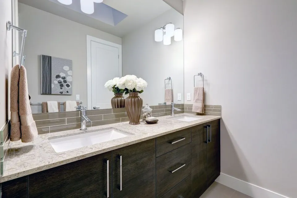
How Countertop Colour Can Make A Small Kitchen Feel Larger
In a compact kitchen, colour has a powerful effect on how the room is perceived. The benchtop occupies a large visual area, reflects available light and sits at eye level when people move through the space, so its shade can influence whether the room feels open and calm or crowded and enclosed. The right surface colour will not change the floor area, but it can soften boundaries and make the kitchen appear more spacious.
This matters in many Australian homes, from narrow terrace kitchens in Sydney and Melbourne apartments to compact renovations in Brisbane, Adelaide and Perth. Countertop colour should be considered alongside cabinetry, splashbacks, flooring, lighting and appliance finishes. When these elements share a considered visual relationship, a small kitchen can feel brighter, longer and easier to use.
Choose A Light Reflective Base
Pale benchtops are usually the safest choice when the goal is to increase the sense of space. White, ivory, soft grey, pale beige and light greige surfaces bounce daylight and artificial illumination around the room, reducing the heavy visual effect created by dark cabinetry or limited windows. A lightly reflective finish can make the work area look cleaner and less visually dense.
Pure white is not the only option, and it is not always the most practical choice for an active household. Warm whites and creamy neutrals can prevent a compact kitchen from feeling stark, especially in older Australian homes with timber flooring or warm-toned joinery. A pale surface with subtle movement often provides depth without creating a strong visual block.
Glossy finishes reflect more light, while honed and matte surfaces offer a softer appearance. Gloss can work well in a contemporary apartment, though it may show fingerprints and glare more readily. A satin or lightly honed finish can still support an airy look while giving the kitchen a more relaxed, tactile character.
Match The Benchtop With Cabinetry
The contrast between the countertop and cabinets affects how clearly the room is divided into horizontal and vertical zones. Strong contrast, such as black benchtops against white cabinets, creates definition and drama, but it can also make a small kitchen appear busier. Low-contrast combinations allow the eye to travel across the room with fewer visual interruptions.
Matching a light benchtop with cabinetry in a related shade can make the perimeter appear more continuous. For example, warm white cupboards with a pale stone surface can blur the line between the cabinet run and the worktop. Light timber cabinetry paired with soft grey or sandy beige can achieve a similar effect while introducing natural variation.
A slightly darker island can still be useful if the surrounding kitchen is compact. Rather than choosing a completely different colour, select a tone from the same family, such as a light grey perimeter with a medium-grey island. This gives the island presence without making it feel like a separate object that closes in the room.
Use Veining To Guide The Eye
Pattern is just as important as colour. Large, dramatic veining can become the main feature of a small kitchen, particularly when the benchtop continues up a splashback. Delicate veining, fine speckles and restrained tonal variation tend to maintain a calmer background and make the room feel less crowded.
Vein direction can also affect perceived proportions. Linear movement running along the length of a narrow benchtop may make the kitchen appear longer. On a small island, gentle horizontal patterns can emphasise its width, while vertical or strongly diagonal marks may draw attention to its limited depth.
Calacatta-style marble looks can be beautiful, but bold veining needs careful placement around joins, sinks and cooktops. Natural marble offers individual character, yet it requires thoughtful maintenance in a busy kitchen. Guidance on marble care can help homeowners understand how sealing, cleaning and everyday use affect the surface over time.
Consider Light Across The Day
A colour sample can look completely different under Australian daylight, warm pendant lights and cool under-cabinet LEDs. A white surface may appear blue beside a window facing south, while a beige surface can look more yellow under warm lighting. Testing samples in the actual kitchen is more reliable than choosing from a showroom photograph.
North-facing rooms generally receive stronger natural light in Australia, while south-facing rooms can feel cooler and dimmer. In Melbourne or Hobart, winter light may be noticeably different from the bright conditions common in Perth or Brisbane. The countertop should be viewed at breakfast, midday and evening before a final decision is made.
Lighting placement matters as much as surface colour. LED strips beneath wall cabinets can brighten the benchtop and reduce shadows along the splashback. Pendant lights over an island add warmth, but lamps with a very yellow tone can change the appearance of pale grey, blue and green surfaces. Neutral white lighting usually gives the most accurate impression of the material.
Explore Colour Through Material Choice
Quartz-look surfaces, granite, porcelain, marble, Dekton and timber each interpret colour differently. A plain white porcelain slab may appear crisp and architectural, while a white granite can contain translucent minerals that create gentle depth. Soapstone brings a naturally dark tone that may suit a compact kitchen when balanced with pale walls, generous lighting and light-coloured cabinetry.
Australian homeowners should also account for current material regulations and supply conditions. Engineered stone benchtops containing silica have been prohibited for manufacture, supply and installation across Australia since 1 July 2024, although existing installations remain in many homes. Porcelain, natural stone and other compliant alternatives may offer the desired colour effect without relying on newly fabricated engineered stone.
Butcher block introduces warmth and texture, which can stop an all-white kitchen from feeling clinical. In a small space, it often works best as a limited feature on a breakfast bar or island rather than across every work surface. Timber colour will deepen or change with age and maintenance, so the initial sample should be considered as part of a longer-term design.
Extend The Colour Beyond The Worktop
A countertop cannot create visual openness by itself. When the same or a closely related colour continues into the splashback, the kitchen gains a longer uninterrupted field. A pale slab splashback with minimal grout lines can make the wall recede, while small contrasting tiles may add charm but create more visible divisions.
Integrated sinks and slim edge profiles can reinforce a streamlined look. Fewer changes in colour and height make the benchtop read as one continuous plane. Waterfall ends can be striking, though on a very small island they may add visual weight; a simple square edge or softened pencil edge can preserve a lighter appearance.
The wall colour, floor finish and hardware should support the chosen palette. Dark grout, black tapware and strong pendant fittings can frame a pale kitchen effectively, but too many high-contrast details may fragment the room. Brushed nickel, stainless steel and softly coloured handles tend to blend more quietly into a compact scheme.
Balance Practicality With Visual Space
The lightest colour is not automatically the best choice for every household. Families who cook frequently may prefer a softly patterned surface that disguises crumbs and minor marks better than a completely uniform white. A practical colour should also suit the way the kitchen is cleaned, used and maintained rather than being selected only for a staged appearance.
Professional templating and fabrication help keep the visual design consistent around walls, corners, sinks and appliances. Accurate measurements reduce awkward joins, while a carefully selected edge profile can make a thick-looking slab appear more refined. Homeowners planning a renovation can review material options, custom surfaces and installation services through The Countertop Store.
The strongest small-kitchen schemes usually rely on one dominant light tone, one supporting neutral and a limited accent colour. This approach leaves room for personality through timber stools, cookware, plants or artwork without allowing accessories to compete with the benchtop. A carefully chosen countertop colour then works quietly in the background, reflecting light and helping the entire kitchen feel more open.