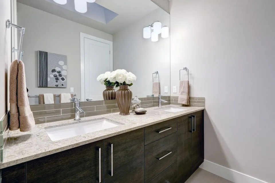
Quartz Colors That Make a Kitchen Feel Bright And Airy
A bright kitchen depends on more than choosing the palest available surface. Color, veining, cabinet tone, natural light, backsplash design, and countertop thickness all influence whether the room feels open and welcoming or flat and overly stark. Quartz is especially useful for this type of remodel because it offers consistent color, durable performance, and a wide range of light-toned patterns.
The right quartz countertop can reflect daylight, visually expand a compact floor plan, and create a clean foundation for wood cabinets, painted cabinetry, metal fixtures, and colorful accessories. In a kitchen where brightness is the goal, subtle variation often creates a more comfortable result than a completely uniform slab.
For homeowners in North Little Rock and surrounding Arkansas communities, selecting the surface in person can make a major difference. Samples viewed under showroom lighting may look different beside existing flooring, wall paint, or windows. A professional fabricator can help coordinate the slab with the entire room while handling measurements, edge details, sink cutouts, and installation.
Why Light Quartz Works In An Airy Kitchen
Quartz has a practical advantage over many natural stones: its color and pattern are generally consistent from slab to slab. That predictability makes it easier to plan a cohesive kitchen, especially when the countertop continues onto a backsplash, island, coffee station, or full-height wall. Light quartz can unify these areas without making the room feel visually busy.
Brightness also comes from the way a surface interacts with light. Polished quartz reflects more illumination and creates a crisp, refined appearance, while a honed or matte finish softens glare and gives the kitchen a calmer character. Neither finish is automatically better. The best choice depends on window placement, under-cabinet lighting, cabinet color, and how much visual movement the room already contains.
A pale countertop does not have to look cold. Warm undertones, delicate veining, and softly blended patterns can introduce depth while preserving an open feeling. This balance is valuable in kitchens with white walls or limited natural light, where an all-white design may otherwise appear sterile.
Crisp White Quartz For Maximum Light
Bright white quartz is a dependable choice when the goal is a clean, spacious look. A surface with a mostly solid white background reflects light across the room and pairs easily with nearly any cabinet color. It works particularly well with white, light gray, natural oak, maple, and painted blue cabinetry.
Pure white quartz creates a streamlined appearance on a large island because the uninterrupted color emphasizes the island’s shape without adding visual weight. It can also make narrow walkways feel wider. For a modern kitchen, pair it with flat-panel cabinets, simple hardware, and a restrained backsplash. For a transitional room, raised-panel doors, brushed nickel, and warmer flooring prevent the design from appearing too stark.
The main consideration is contrast. White countertops can show crumbs, spills, and dark objects more clearly than medium-tone surfaces. That visibility is helpful for cleaning, but homeowners who prefer a forgiving work surface may want a white quartz with fine movement instead of a completely solid pattern. A subtle gray or beige thread can add dimension without reducing brightness.
White quartz is also a strong choice for integrated sinks and waterfall island edges. These details create visual continuity, making the countertop feel like a single architectural element rather than a separate slab placed on top of cabinets.
Warm Ivory Quartz For A Softer Glow
Warm ivory and creamy quartz bring brightness with a more relaxed atmosphere. Instead of a sharp, blue-white background, these surfaces contain beige, cream, or soft almond undertones. They complement honey oak, walnut, natural maple, and other wood finishes especially well.
This color family is useful when the kitchen includes warm flooring, brass hardware, or earthy backsplash tile. A cool white countertop beside golden wood can make the cabinets look yellow, while an ivory surface connects the elements more naturally. The result is still light and airy, but it feels comfortable rather than clinical.
Some warm quartz designs include faint taupe veining or cloudy tonal shifts. These patterns help disguise everyday marks and create a handmade, layered appearance. They are a good fit for farmhouse, transitional, Mediterranean, and contemporary kitchens that need brightness without a stark modern edge.
When reviewing ivory slabs, compare them under both daylight and artificial lighting. Warm quartz may appear creamier in rooms with warm LED bulbs. Coordinating the light temperature with the countertop sample helps preserve the intended color throughout the day.
Soft Gray Quartz For Balanced Contrast
Light gray quartz offers a bright foundation while providing more contrast than white. It can define the countertop against white cabinets, making the island and perimeter worktops easier to see. Soft gray is especially effective in kitchens with stainless steel appliances, black window frames, or cool-toned flooring.
The most versatile gray quartz has a gentle background rather than a heavy charcoal cast. Misty gray, silver-gray, and pale dove shades keep the room luminous. Patterns with fine white movement can make the slab appear lighter, while broader gray veining gives it a more dramatic stone-inspired presence.
Gray countertops can support several design directions. With white cabinetry and chrome fixtures, they create a fresh contemporary scheme. With deep blue or green cabinets, they provide a calm neutral transition. With natural wood, they introduce contrast and keep the room from becoming too warm.
The finish matters here as well. A polished gray slab can reflect light and emphasize the cool clarity of the color. A honed surface may look more architectural and understated, especially in a kitchen with strong sunlight or many reflective finishes.
Comparing Light Quartz Colors
Choosing among pale surfaces becomes easier when the color is evaluated alongside cabinet materials, lighting, and maintenance preferences. A white countertop may reflect the most light, but a warm ivory surface can make a wood-centered kitchen feel brighter because the undertones coordinate more successfully. Soft gray may offer the best balance for homeowners who want a light room with visible definition.
Pattern scale should be considered along with background color. Fine veining is usually easier to live with in a smaller kitchen or a room with a detailed backsplash. Larger veins make a statement on an island, but they need enough surrounding space to remain legible rather than competing with cabinet doors and decorative features.
| Quartz color | Overall effect | Best cabinet pairings | Pattern and design notes |
|---|---|---|---|
| Crisp white | Brightest, cleanest, and most reflective | White, light gray, oak, maple, blue | Best for minimalist spaces and strong visual continuity |
| Warm ivory | Soft, welcoming, and gently luminous | Walnut, honey oak, maple, cream | Works well with brass, warm flooring, and earthy tile |
| Pale gray | Fresh with moderate contrast | White, navy, sage, natural wood | Defines work areas without making the kitchen feel dark |
| Light greige | Balanced between gray and beige | White, taupe, mushroom, medium wood | A flexible neutral for transitional and updated traditional rooms |
| White with delicate veining | Bright with natural-stone character | White, charcoal, blue, green, wood | Adds movement while preserving an open overall appearance |
Samples should be viewed vertically and horizontally because a countertop can look different when installed on a cabinet run versus an island. Place samples beside the backsplash, cabinet door, flooring, and wall paint. This simple comparison often reveals undertones that are easy to miss when looking at a single sample by itself.
Light Greige For A Flexible Neutral Foundation
Greige quartz combines the softness of beige with the restraint of gray. It is a useful option when a kitchen needs to coordinate with several materials that do not share the same undertone. A light greige surface can bridge cool white cabinetry and warm wood flooring without making either element appear out of place.
This color is especially effective in open-concept homes where the kitchen connects to a living or dining area. Its quiet appearance transitions easily into adjacent spaces and avoids the high contrast that can make the kitchen feel visually separate. Light greige also provides a forgiving background for daily cooking, particularly when the pattern includes mild tonal variation.
For a more modern result, choose a greige slab with a smooth background and narrow linear movement. For a traditional or rustic kitchen, a cloudy pattern with cream and taupe accents can echo natural stone. Pairing the surface with an undermount sink and a simple eased or pencil edge keeps the look polished without unnecessary ornament.
Because greige can shift under different bulbs, lighting should be part of the selection process. Cool lighting may bring out its gray side, while warm lighting emphasizes beige. A fabricator or designer can help compare samples in the actual kitchen environment before the slab is ordered.
White Quartz With Natural-Looking Veining
White quartz with gray, taupe, or soft beige veining gives a kitchen the brightness of a pale surface and the character associated with marble. This category is popular for islands, perimeter counters, and full-height backsplashes because the pattern adds movement without requiring a darker color.
The most airy designs use veins that are delicate, widely spaced, or softly blended. These patterns draw the eye across the slab instead of stopping it with abrupt contrast. A subtle marble-look quartz can serve as the room’s focal point while allowing cabinets and hardware to remain relatively simple.
More dramatic veining can work beautifully, especially on a large island, but it requires careful slab layout. The fabricator may need to plan vein direction, seam placement, and bookmatching so the pattern appears intentional. This is one reason professional templating is important. Measurements taken after cabinets are installed help account for walls, corners, appliances, and overhangs with greater accuracy.
For homeowners considering a coordinated backsplash, extending the same quartz up the wall creates a clean, spacious envelope around the work area. You can review available fabrication and installation options through the company’s custom kitchen services, including countertop details that help the selected color perform as part of a complete remodeling design.
Practical Details Before Ordering A Slab
Color is central to the design, but performance and fabrication details should be reviewed before making a final selection. Ask how the chosen quartz will be supported around a sink, cooktop, dishwasher, or seating overhang. These areas may require specific cabinet reinforcement or installation methods.
It is also useful to think about how the countertop will connect with other surfaces. A matching quartz backsplash can provide a seamless appearance, while ceramic tile introduces texture and color. A waterfall edge emphasizes a contemporary island, whereas a standard eased edge is quieter and often better suited to traditional cabinetry.
Keep these selection points in mind:
- Compare samples beside cabinet doors, flooring, backsplash tile, and wall paint.
- View the quartz in both natural daylight and the kitchen’s planned artificial lighting.
- Choose subtle movement for a calm room and stronger veining for a defined focal point.
- Confirm seam locations, edge profiles, overhangs, and sink details before fabrication.
- Review the care instructions and use cutting boards, trivets, and approved cleaners as recommended.
A professional measurement and templating process protects the visual plan as well as the installation. It ensures that the selected pattern is placed thoughtfully around corners, appliances, sinks, and seating areas. It also gives homeowners a chance to confirm the final color and edge profile before fabrication begins.
The best light quartz color is the one that works with the whole kitchen rather than the one that looks brightest in isolation. Crisp white, warm ivory, pale gray, light greige, and softly veined white quartz can all create an open atmosphere when their undertones and patterns suit the surrounding materials.
Bring cabinet samples, flooring information, and lighting plans to a countertop consultation in North Little Rock. With careful selection, accurate templating, and professional installation, a quartz surface can give the kitchen lasting brightness, practical durability, and a welcoming sense of space.