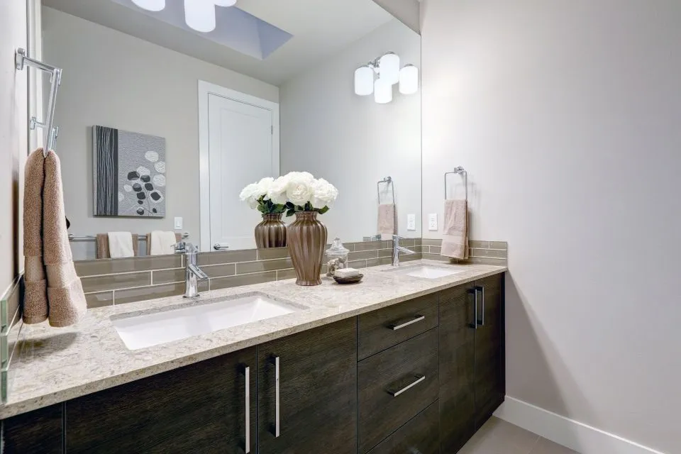
How to match a countertop color with existing flooring in a bathroom
A bathroom floor usually carries more visual weight than the countertop because it fills the largest uninterrupted plane in the room. The aim when matching a countertop color with flooring is not to create two identical blocks, but to let the surfaces share an undertone while one remains distinct enough to feel intentional. That gives a small room more depth without making it look flat or overly coordinated.
Tile and cabinet choices are often made at different stages of an Australian renovation. A new vanity may be ordered after the floor is already installed, especially in a character home in inner-city Melbourne or a suburban house being refreshed around Brisbane. Before ordering the stone, take a physical floor sample and a photograph of the full room, then view them beside the proposed splashback, cabinet fronts and tapware rather than judging each item alone.
Light can shift a colour more than most people expect. A north-facing window may make a soft grey look warmer around midday, while a dim room at night can send the same stone toward blue. Australian homes often pair abundant daylight with warm evening LEDs, so test the colour under both conditions. A supplier’s showroom is useful, but a sample placed at the actual bathroom door gives a much better indication.
Good colour matching also depends on practical choices. Quartz, granite, porcelain, marble and engineered stone each have different patterns, movement and maintenance needs, while the flooring may be glossy tile, matte porcelain, timber or resilient sheet. The strongest result comes from balancing appearance with water resistance, slip considerations and cleaning habits, rather than treating colour as the only issue.
Start with the floor’s dominant tone
Identify the floor’s main hue first: warm beige, cool grey, soft white, earthy brown, greenish stone or something more saturated. Then look for its undertone, which is the subtle warm, cool or neutral colour beneath the main shade. A material with a warm beige background will usually sit comfortably with honey timber and creamy cabinetry, while a cool grey floor tends to pair best with restrained, similarly cool worktops.
If the floor contains several colours, decide which one should lead the palette. Large-format tiles can contain mottling, cloudy variation or a network of veins; selecting that movement as the guide keeps the countertop from competing with it. When in doubt, choose the quieter element for the vanity because the countertop is closer to your eyes and occupies less floor area but acts as a focal point.
Frequent use of 600 by 600 millimetre porcelain tiles in contemporary Australian bathrooms makes the scale of grout lines and repeated pattern important. A bold, strongly veined worktop over a busy tiled floor can feel crowded. A calm solid or finely speckled slab, by comparison, can make the same floor feel more spacious and provide a clean landing area around the basin.
Read undertones before choosing a stone colour
Undertone is where two neutral colours often reveal whether they truly belong together. Test combinations of cream, sand, greige, mushroom, charcoal and pale taupe by placing the samples next to one another. Colours that look similar on a shelf can clash when their warm and cool bases meet, particularly beside timber, chrome, brushed nickel or brass fittings.
Pattern needs similar attention. Fine speckles echo small floor flecks without copying them, broad cloudy movement relates to marble-look porcelain, and dramatic veining can work when the floor is quiet. A useful rule is to repeat one visual idea rather than every feature: carry the floor’s warmth into the stone, or repeat its vein direction in a smaller format, but avoid introducing a third competing pattern.
Budget and fabrication method also shape the options. Before the final selection, compare custom countertop material costs, since marble, granite and porcelain differ in material price, fabrication demands and wastage as well as appearance. Imported slabs may offer dramatic movement but can limit matching if a later repair is needed, whereas a repeatable porcelain or quartz surface can be easier to coordinate across separate pieces.
Match the flooring type, not an imagined colour name
Ceramic and porcelain floors often create the easiest decision because their colour range runs from warm ivory through cool grey to near-black. Check the grout as carefully as the tile, since grout can lighten a dark floor or sharpen a pale one. With a patterned tile, a simple countertop usually provides balance. With a plain tile, a slab with controlled movement can add character without disturbing the room.
Marble floors require a more deliberate response. The best match is often not the same white and grey but a stone with a comparable distribution of light and dark areas. Ask to see the full slab, several slabs if available, and a photograph of the proposed cut layout. Natural stone varies between batches, so approving a small polished piece does not guarantee that the installed surface will have identical movement.
Timber and timber-look floors introduce warmth, grain and scale. Australian homes frequently use oak-look porcelain planks alongside matte-black or brushed-metal tapware, so the countertop can either continue that softness with a warm off-white or provide a controlled contrast in charcoal. For resilient flooring, sheet vinyl and microcement, concentrate on the floor’s base colour and texture because the pattern may be less important than the overall mood.
Test samples in the actual bathroom
Carry more than a tiny swatch into the room. A stone sample large enough to include several veins or speckles will reveal scale, while a sample of the actual floor tile should be viewed with the proposed countertop, wall surface and cabinet door. Tape both to a wall at eye level and step back. A distinctly Australian way to put it is to “have a good look” rather than make a quick call from a website image.
Observe the samples at different times of day, but also inspect them under the bathroom’s normal lighting. Colours can change near a window, mirror and white wall, while gloss finishes may reflect more light than a matte floor. Check them beside the actual grout, not an idealised colour on a display board. If the bathroom has little natural light, the cabinetry and wall colour will influence the result more heavily.
Scale and placement deserve a separate check. A dramatic vein that looks balanced on a large sample may become too busy when it crosses a narrow vanity. For a related wet-zone idea, a low-maintenance quartz shower bench shows how the same surface language can be carried into another part of a bathroom. Keep the bench or shower base visually quieter if the floor and vanity already provide strong movement.
Coordinate the walls, cabinetry and fittings
The countertop sits within a group of finishes, and those neighbouring elements can either strengthen or muddy the floor relationship. Pull together the wall tile or paint, vanity colour, door finish, mirror frame, tapware and lighting. A bathroom with cool porcelain and grey cabinetry may need a slightly warm stone to stop the palette becoming clinical; a room with walnut timber and deep green paint can support a clean cream surface.
Do not force every finish to match exactly. Complementary colours create contrast, while one repeated tone gives continuity. For example, a pale greige countertop can bridge a beige floor and charcoal cabinets without trying to reproduce either colour. Matte black fittings usually suit a crisp contrast; brushed brass and aged bronze work well with warmer timber and honeyed stone; chrome is a flexible option but can look sharper than intended against a very warm palette.
Australia’s renovation market offers a broad mix of imported tiles, European and Asian ceramics, engineered timber and local cabinetmakers, so unusual combinations are easy to source. The practical challenge is keeping the sample trail disciplined. Label every finish, record the batch or batch code, and take the same photos under consistent lighting. This matters when replacements are ordered months later and the original colour is no longer sitting on the table.
Confirm the surface and installation details early
Floor selection should be settled before the vanity top is templated, especially if the countertop will sit directly over the floor edge or meet a tiled upstand. Measure the finished walls rather than the framing, verify the finished floor level and note any out-of-square corners. Australian cabinetry is commonly planned in millimetres, and bath vanity tops often need a different depth and overhang from kitchen worktops, so do not transfer kitchen dimensions by eye.
Choose the material for the wet zone as well as its appearance. Porcelain is highly practical where staining and heat need little concern, while quartz and many granites suit daily use but may require attention to seams and water exposure. Marble and natural soapstone bring character yet can react with acids and need more considered sealing. A fabricator should explain how the selected edge, polished surface and cutouts will be finished for the actual bathroom conditions.
Keep the floor sample, grout sample and approved countertop reference together until installation. If the project includes a separate shower, check that the shower floor is not intended to share the same colour, because that surface has different cleaning and drainage needs. Once the template, slab selection and edging details are confirmed, coordinate the fit-out so the cabinet, wall finish and new countertop arrive in the correct order. The result is a bathroom where the floor remains clearly visible, the worktop feels deliberately chosen, and the two colours enhance rather than imitate each other.